 DEEPAKsingh74
react-streamify-play library a customizable and easy to use video player for react application.
react-streamify-play
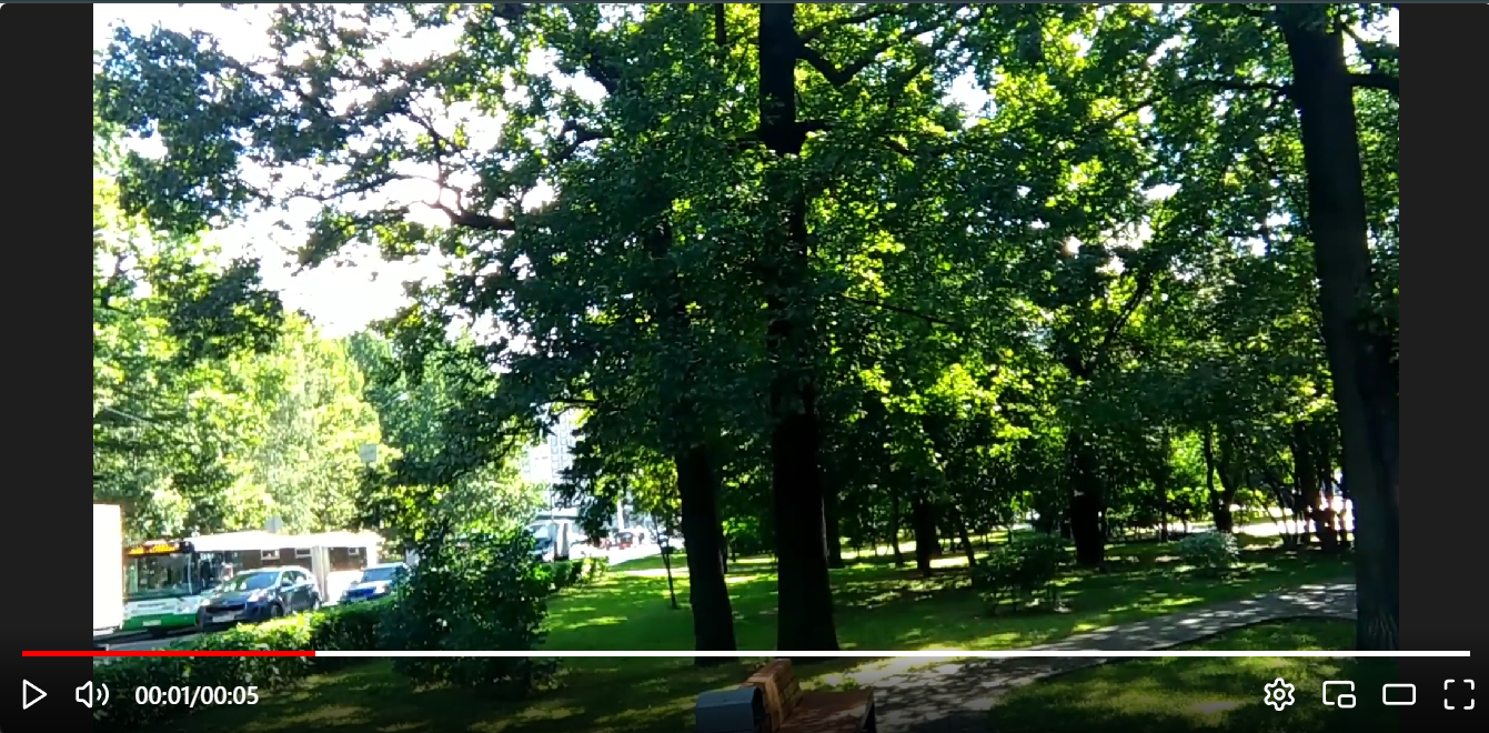
Video player for react application.
Installation Guide
using yarn
yarn add react-streamify-playusing npm
npm i react-streamify-playusing npm
npm install react-streamify-playGetting Started
Basic Implementation
import {
    controlOptionsEnum,
    VPlayer }
from "react-streamify-play"

<VPlayer source={"Your video source"} />
Supported Formats
| Format | Description | File Type |
|---|---|---|
| MP4 | A widely supported video format, ideal for most use cases. | .mp4 |
| OGG | Open-source video format with broad browser support, often used for web streaming. | .ogv |
| WebM | Open and royalty-free video format, commonly used in modern browsers for HTML5 video. | .webm |
| HLS | HTTP Live Streaming, used for streaming video over the internet in real-time. | .m3u8 (playlist) |
| MPEG-DASH | Dynamic Adaptive Streaming over HTTP, a streaming protocol for high-quality video streaming. | .mpd (playlist) |
Documentation
Control options
- If you want only few video controls just remove them from
.controlOptions.
<VPlayer
        source={sources[3]}
        // all control options available
        controlOptions={[
          controlOptionsEnum.PLAY,
          controlOptionsEnum.MUTE,
          controlOptionsEnum.SETTINGS,
          controlOptionsEnum.PICTURE_IN_PICTURE,
          controlOptionsEnum.THEATER_MODE,
          controlOptionsEnum.PREVIOUS,
          controlOptionsEnum.NEXT,
          controlOptionsEnum.SETTINGS,
          controlOptionsEnum.FULLSCREEN
        ]}
/>
Loading
- If you want custom loading HTML Element pass the
.loadingAssetwhich is a.ReactNodetype.
<VPlayer
    source={sources[3]}
    loadingAsset={<div>Loading...</div>}
/>
Custom Events
- If you want custom analytics feature you can add the
.Javascriptevent listeners directly to the.eventsprop.
<VPlayer
    source={sources[0]}
    events={
        {
            onLoadedData: () => console.log("Loaded data"),
            onError: () => console.log("Error")
          }
        }
/>
Video Header
- If you want to add custom header to the video to show video title or some other option you can pass
.VideoHeader.
<VPlayer
        source={sources[0]}
        VideoHeader={<h1>Custom Video Header</h1>}
    />
Previous and Next click
- Handle the previous video link and next video link.
<VPlayer
        source={sources[0]}
        handleNext={() => console.log("Next")}
        handlePrev={() => console.log("Prev")}
    />
Custom video and videocontainer styles
- You can add custom styles to the
.VideoContaineror.Videoelement.
<VPlayer
        source={sources[0]}
        videoContainerStyles={
          {
            width: "100%",
            height: "100%"
            // and soo on..
          }
        }

        videoStyles={
            {
            width: "100%",
                    height: "100%"
            // and soo on..
                }
        }
    />
Theater Mode
- You can adjust the
.TheaterMode
<VPlayer
        source={sources[0]}
        handleTheaterMode={() => console.log("Theater Mode")}
    />