Important: This documentation covers Yarn 1 (Classic).
For Yarn 2+ docs and migration guide, see yarnpkg.com.

Package detail

@backstage/theme

backstage502.2kApache-2.00.6.6TypeScript support: included

material-ui theme for use with Backstage.

backstage

readme

headline

Backstage

English | 한국어 | 中文版 | Français

License CNCF Status Discord Code style Codecov OpenSSF Best Practices OpenSSF Scorecard

What is Backstage?

Backstage is an open source framework for building developer portals. Powered by a centralized software catalog, Backstage restores order to your microservices and infrastructure and enables your product teams to ship high-quality code quickly without compromising autonomy.

Backstage unifies all your infrastructure tooling, services, and documentation to create a streamlined development environment from end to end.
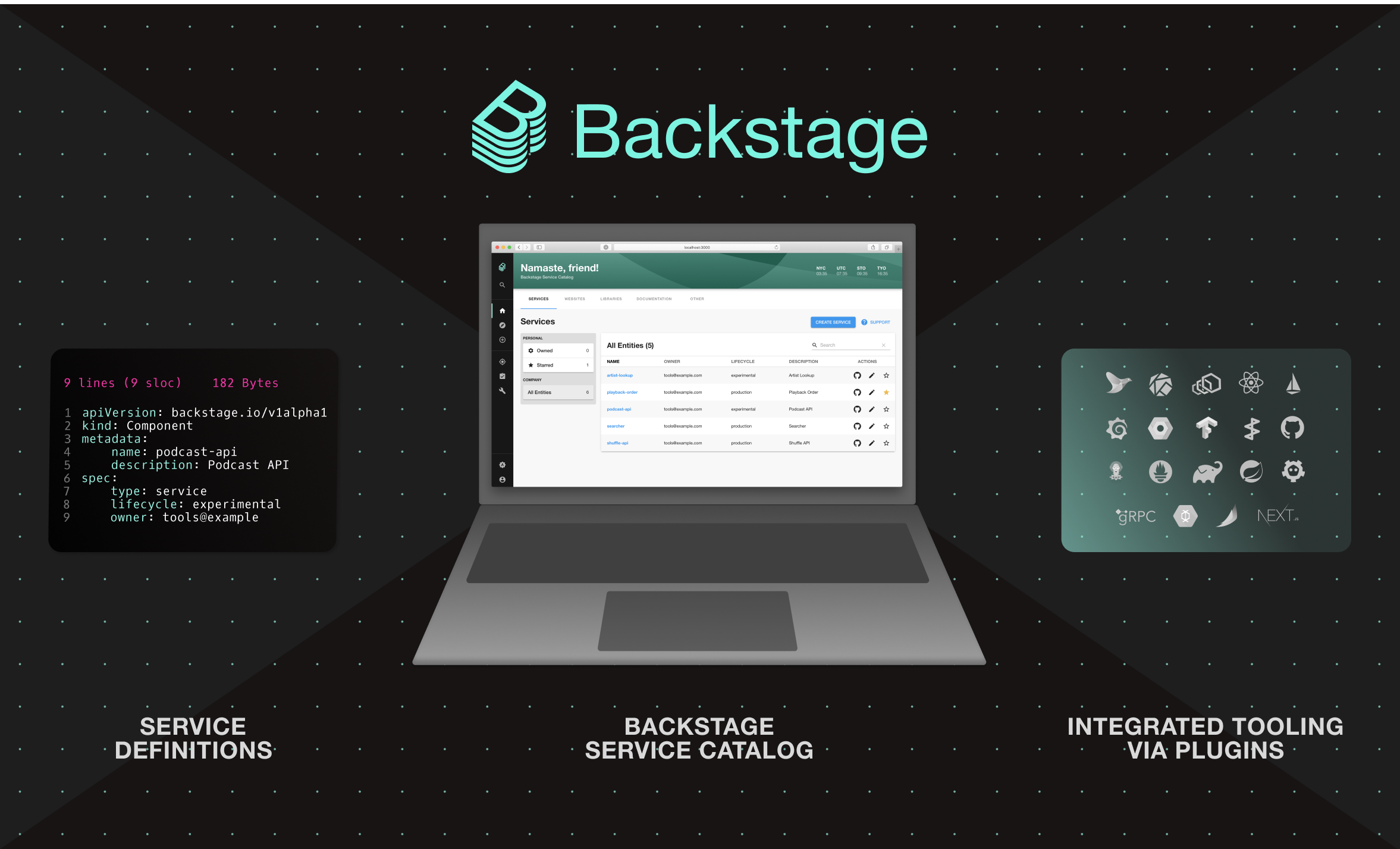
software-catalog

Out of the box, Backstage includes:

  • Backstage Software Catalog for managing all your software such as microservices, libraries, data pipelines, websites, and ML models
  • Backstage Software Templates for quickly spinning up new projects and standardizing your tooling with your organization’s best practices
  • Backstage TechDocs for making it easy to create, maintain, find, and use technical documentation, using a "docs like code" approach
  • Plus, a growing ecosystem of open source plugins that further expand Backstage’s customizability and functionality

Backstage was created by Spotify but is now hosted by the Cloud Native Computing Foundation (CNCF) as an Incubation level project. For more information, see the announcement.

Project roadmap

For information about the detailed project roadmap including delivered milestones, see the Roadmap.

Getting Started

To start using Backstage, see the Getting Started documentation.

Documentation

The documentation of Backstage includes:

Community

To engage with our community, you can use the following resources:

Governance

See the GOVERNANCE.md document in the backstage/community repository.

License

Copyright 2020-2025 © The Backstage Authors. All rights reserved. The Linux Foundation has registered trademarks and uses trademarks. For a list of trademarks of The Linux Foundation, please see our Trademark Usage page: https://www.linuxfoundation.org/trademark-usage

Licensed under the Apache License, Version 2.0: http://www.apache.org/licenses/LICENSE-2.0

Security

Please report sensitive security issues using Spotify's bug-bounty program rather than GitHub.

For further details, see our complete security release process.

changelog

@backstage/theme

0.6.6

Patch Changes

  • 1b14572: Show arrow when MuiTableSortLabel receives focus

0.6.6-next.0

Patch Changes

  • 1b14572: Show arrow when MuiTableSortLabel receives focus

0.6.5

Patch Changes

0.6.5-next.0

Patch Changes

0.6.4

Patch Changes

  • 58ec9e7: Removed older versions of React packages as a preparatory step for upgrading to React 19. This commit does not introduce any functional changes, but removes dependencies on previous React versions, allowing for a cleaner upgrade path in subsequent commits.

0.6.4-next.0

Patch Changes

  • 58ec9e7: Removed older versions of React packages as a preparatory step for upgrading to React 19. This commit does not introduce any functional changes, but removes dependencies on previous React versions, allowing for a cleaner upgrade path in subsequent commits.

0.6.3

Patch Changes

  • 5f04976: Fixed a bug that caused missing code in published packages.

0.6.3-next.0

Patch Changes

  • 5f04976: Fixed a bug that caused missing code in published packages.

0.6.1

Patch Changes

  • ea75c37: Internal refactor to avoid top-level imports from MUI.

0.6.1-next.0

Patch Changes

  • ea75c37: Internal refactor to avoid top-level imports from MUI.

0.6.0

Minor Changes

  • e77ff3d: Adds support for custom background colors in code blocks and inline code within TechDocs.

Patch Changes

  • e969dc7: Move @types/react to a peer dependency.

0.6.0-next.1

Minor Changes

  • e77ff3d: Adds support for custom background colors in code blocks and inline code within TechDocs.

0.5.8-next.0

Patch Changes

  • e969dc7: Move @types/react to a peer dependency.

0.5.7

Patch Changes

  • 836127c: Updated dependency @testing-library/react to ^16.0.0.

0.5.7-next.0

Patch Changes

  • 836127c: Updated dependency @testing-library/react to ^16.0.0.

0.5.6

Patch Changes

  • 702fa7d: Internal refactor to fix an issue where the MUI 5 v5- class prefixing gets removed by tree shaking.

0.5.6-next.0

Patch Changes

  • 702fa7d: Internal refactor to fix an issue where the MUI 5 v5- class prefixing gets removed by tree shaking.

0.5.4

Patch Changes

  • f1462df: Fixed bug where scrollbars don't pick up the theme when in dark mode

0.5.4-next.0

Patch Changes

  • f1462df: Fixed bug where scrollbars don't pick up the theme when in dark mode

0.5.3

Patch Changes

  • abfbcfc: Updated dependency @testing-library/react to ^15.0.0.

0.5.2

Patch Changes

  • 6f4d2a0: Exported defaultTypography to make adjusting these values in a custom theme easier

0.5.2-next.0

Patch Changes

  • 6f4d2a0: Exported defaultTypography to make adjusting these values in a custom theme easier

0.5.1

Patch Changes

  • dd5d7cc: Fixed missing extra variables like applyDarkStyles in Mui V5 theme after calling createUnifiedThemeFromV4 function
  • 8fe56a8: Widen @types/react dependency range to include version 18.

0.5.1-next.1

Patch Changes

  • dd5d7cc: Fixed missing extra variables like applyDarkStyles in Mui V5 theme after calling createUnifiedThemeFromV4 function

0.5.1-next.0

Patch Changes

  • 8fe56a8: Widen @types/react dependency range to include version 18.

0.5.0

Minor Changes

  • 4d9e3b3: Added a global OverrideComponentNameToClassKeys for other plugins and packages to populate using module augmentation. This will in turn will provide component style override types for createUnifiedTheme.

Patch Changes

  • cd0dd4c: Align Material UI v5 Paper component background color in dark mode to v4.

0.5.0-next.1

Patch Changes

  • cd0dd4c: Align Material UI v5 Paper component background color in dark mode to v4.

0.5.0-next.0

Minor Changes

  • 4d9e3b39e4: Added a global OverrideComponentNameToClassKeys for other plugins and packages to populate using module augmentation. This will in turn will provide component style override types for createUnifiedTheme.

0.4.4

Patch Changes

  • 6c2b872153: Add official support for React 18.

0.4.4-next.0

Patch Changes

  • 6c2b872153: Add official support for React 18.

0.4.3

Patch Changes

  • 5ad5344756: Added support for string fontSize values (e.g. "2.5rem") in themes in addition to numbers. Also added an optional fontFamily prop for header typography variants to allow further customization.

0.4.3-next.0

Patch Changes

  • 5ad5344756: Added support for string fontSize values (e.g. "2.5rem") in themes in addition to numbers. Also added an optional fontFamily prop for header typography variants to allow further customization.

0.4.2

Patch Changes

  • 406b786a2a2c: Mark package as being free of side effects, allowing more optimized Webpack builds.

0.4.2-next.0

Patch Changes

  • 406b786a2a2c: Mark package as being free of side effects, allowing more optimized Webpack builds.

0.4.1

Patch Changes

  • 4f28914d9f0e: Overwrite PaletteOptions & ThemeOptions type to allow use of createTheme from @backstage/theme as well as @material-ui/core/styles with the same type. Also replaced the default CSSBaseline with v4 instead of v5 for better backwards compatibility for now.
  • 41c5aa0ab589: Applying the modified theme.spacing method only to overrides instead of replacing it in the whole theme.
  • 9395baa82413: You can now customize the typography of your theme by passing in your own custom typography defaults
  • 8174cf4c0edf: Fixing MUI / Material UI references
  • f0444f094396: Removed the hard coded color and background color in the MuiChip overrides so that they work better with custom themes
  • 874c3e8bf909: Override the spacing to a v5 compliant method

0.4.1-next.1

Patch Changes

  • 8174cf4c0edf: Fixing MUI / Material UI references

0.4.1-next.0

Patch Changes

  • 4f28914d9f0e: Overwrite PaletteOptions & ThemeOptions type to allow use of createTheme from @backstage/theme as well as @material-ui/core/styles with the same type. Also replaced the default CSSBaseline with v4 instead of v5 for better backwards compatibility for now.
  • 874c3e8bf909: Override the spacing to a v5 compliant method

0.4.0

Minor Changes

  • 1fd38bc4141a: Material UI v5 Support: Adding platform-wide support for Material UI v5 allowing a transition phase for migrating central plugins & components over. We still support v4 instances & plugins by adding a

    To allow the future support of plugins & components using Material UI v5 you want to upgrade your AppTheme's to using the UnifiedThemeProvider

         Provider: ({ children }) => (
    -    <ThemeProvider theme={lightTheme}>
    -      <CssBaseline>{children}</CssBaseline>
    -    </ThemeProvider>
    +    <UnifiedThemeProvider theme={builtinThemes.light} children={children} />
         ),

Patch Changes

  • 5065a5e8ebd6: Tweaked UnifiedThemeProvider to avoid overlapping JSS class names in production.

0.4.0-next.1

Patch Changes

  • 5065a5e8ebd6: Tweaked UnifiedThemeProvider to avoid overlapping JSS class names in production.

0.4.0-next.0

Minor Changes

  • 1fd38bc4141a: Material UI v5 Support: Adding platform-wide support for Material UI v5 allowing a transition phase for migrating central plugins & components over. We still support v4 instances & plugins by adding a

    To allow the future support of plugins & components using Material UI v5 you want to upgrade your AppTheme's to using the UnifiedThemeProvider

         Provider: ({ children }) => (
    -    <ThemeProvider theme={lightTheme}>
    -      <CssBaseline>{children}</CssBaseline>
    -    </ThemeProvider>
    +    <UnifiedThemeProvider theme={builtinThemes.light} children={children} />
         ),

0.3.0

Minor Changes

  • 98c0c199b15: Updates light theme's primary foreground and running status indicator colours to meet WCAG. Previously #2E77D0 changed to #1F5493.

Patch Changes

  • 83b45f9df50: Fix accessibility issue with Backstage Table's header style

0.3.0-next.0

Minor Changes

  • 98c0c199b15: Updates light theme's primary foreground and running status indicator colours to meet WCAG. Previously #2E77D0 changed to #1F5493.

Patch Changes

  • 83b45f9df50: Fix accessibility issue with Backstage Table's header style

0.2.19

Patch Changes

  • 303c2c3ce51: Allow closeButton color in DismissableBanner to be configurable (via. theme.palette.banner.closeButtonColor)
  • e0c6e8b9c3c: Update peer dependencies

0.2.19-next.0

Patch Changes

  • e0c6e8b9c3c: Update peer dependencies

0.2.18

Patch Changes

  • 482dae5de1c: Updated link to docs.

0.2.18-next.0

Patch Changes

  • 482dae5de1c: Updated link to docs.

0.2.17

Patch Changes

  • b7705e176c: Use same table header color as @backstage/core-components Table to meet accessibility color contrast requirements. This change affects material-ui tables.

0.2.16

Patch Changes

  • ff4f56eb49: DEPRECATED: The bursts object from BackstagePaletteAdditions has been depreciated and will be removed in a future release

    The genPageTheme function now includes an optional options object with an optional fontColor which defaults to white if not provided.

  • 4c09c09102: Adds optional htmlFontSize property and also sets typography design tokens for h5 and h6 in base theme.

0.2.16-next.1

Patch Changes

  • ff4f56eb49: DEPRECATED: The bursts object from BackstagePaletteAdditions has been depreciated and will be removed in a future release

    The genPageTheme function now includes an optional options object with an optional fontColor which defaults to white if not provided.

0.2.16-next.0

Patch Changes

  • 4c09c09102: Adds optional htmlFontSize property and also sets typography design tokens for h5 and h6 in base theme.

0.2.15

Patch Changes

  • c77c5c7eb6: Added backstage.role to package.json

0.2.14

Patch Changes

  • e34f174fc5: Added <SidebarSubmenu> and <SidebarSubmenuItem> to enable building better sidebars. You can check out the storybook for more inspiration and how to get started.

    Added two new theme props for styling the sidebar too, navItem.hoverBackground and submenu.background.

  • 59677fadb1: Improvements to API Reference documentation

0.2.13

Patch Changes

  • c11a37710a: Added a warning variant to DismissableBanner component. If you are using a custom theme, you will need to add the optional palette.banner.warning color, otherwise this variant will fall back to the palette.banner.error color.

0.2.12

Patch Changes

  • 40cfec8b3f: More theme API cleanup
  • a15d028517: More API fixes: mark things public, add docs, fix exports

0.2.11

Patch Changes

  • 75bc878221: Internal refactor to avoid importing all of @material-ui/core.

0.2.10

Patch Changes

  • 6b1afe8c0: Add a configurable palette.bursts.gradient property to the Backstage theme, to support customizing the gradients in the ItemCard header.

0.2.9

Patch Changes

  • 9d40fcb1e: - Bumping material-ui/core version to at least 4.12.2 as they made some breaking changes in later versions which broke Pagination of the Table.
    • Switching out material-table to @material-table/core for support for the later versions of material-ui/core
    • This causes a minor API change to @backstage/core-components as the interface for Table re-exports the prop from the underlying Table components.
    • onChangeRowsPerPage has been renamed to onRowsPerPageChange
    • onChangePage has been renamed to onPageChange
    • Migration guide is here: https://material-table-core.com/docs/breaking-changes

0.2.8

Patch Changes

  • e7c5e4b30: Update installation instructions in README.

0.2.7

Patch Changes

  • 7b8272fb7: Remove extra bottom padding in InfoCard content

0.2.6

Patch Changes

  • 931b21a12: Replace the link color in dark theme

0.2.5

Patch Changes

  • 4618774ff: Changed color for Add Item, Support & Choose buttons with low contrast/readability in dark mode

0.2.4

Patch Changes

  • 2089de76b: Deprecated ItemCard. Added ItemCardGrid and ItemCardHeader instead, that can be used to compose functionality around regular Material UI Card components instead.

0.2.3

Patch Changes

  • c810082ae: Updates warning text color to align to updated WarningPanel styling

0.2.2

Patch Changes

  • 1665ae8bb: Add a little more padding in dense tables

0.2.1

Patch Changes

  • 4577e377b: Improve styling of outlined chips in dark mode.

0.2.0

Minor Changes

  • 0d4459c08: Tweak dark mode colors

Patch Changes

  • ae5983387: Fix banner position and color

    This PR closes: #2245

    The "fixed" props added to control the position of the banner. When it is set to true the banner will be shown in bottom of that page and the width will be based on the content of the message.