 digitsapiens
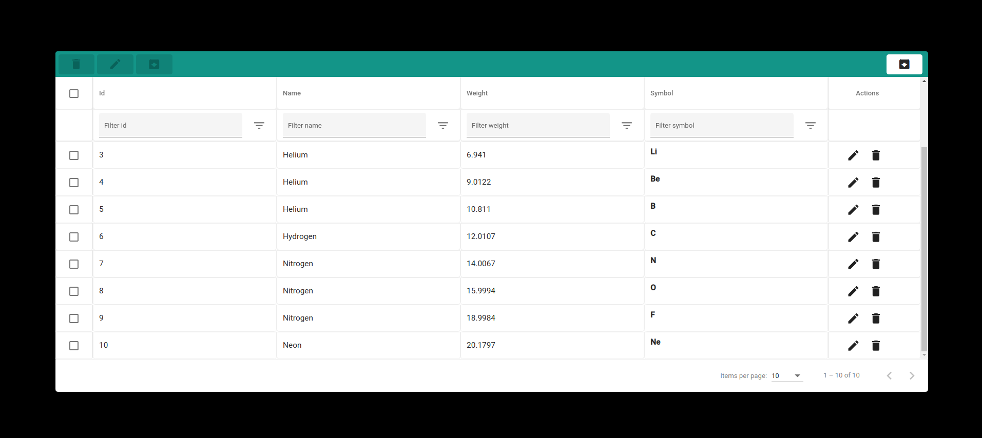
NgxTable
Digit Sapiens Angular Starter is a setup based on Angular 9+.
This library was generated with Angular CLI version 10.1.6.
New Features!
- Angular 9+
Table is designed as follow
Scalability Optimized Client side logic
Installation
NgxTable requires Node.js v4+ to run.
Install the dependencies and devDependencies and start the server.
$ npm i @digitsapiens/ngx-table --saveimport { NgxTableModule } from './ngx-table/ngx-table.module'; <app-ngx-table [data]="config.data" [config]="config"> </app-ngx-table>Add custom cell template and use it inside the colDef.
    <app-ngx-table [search]="search" [data]="config.data" [config]="config" [templates]="{symbol:symbol}">
        <ng-template #symbol let-row>
            <p><strong>{{row.symbol}}</strong></p>
        </ng-template>
    </app-ngx-table>
Add custom actions
    <app-ngx-table [search]="search" [data]="config.data" [config]="config" [customActions]="customActions"
        [templates]="{symbol:symbol}">
        <ng-template #symbol let-row>
            <p><strong>{{row.symbol}}</strong></p>
        </ng-template>
        <ng-template #customActions let-row>
            <button mat-icon-button>View</button>
        </ng-template>
    </app-ngx-table>
config: Config = {
colDefs: [
{
headerName: "Id",
name: "id",
type: ColType.text,
filters: {} as Filters,
},
{
headerName: "Name",
name: "name",
type: ColType.text,
filters: {} as Filters,
},
{
headerName: "Weight",
name: "weight",
type: ColType.numeric,
filters: {} as Filters,
footerAgg?: (data: any) => any;
},
{
headerName: "Symbol",
name: "symbol",
type: ColType.text,
filters: {} as Filters,
template:'symbol'
},
],
data: ELEMENT_DATA,
groups: [
{ colspan: 2, id: "header-row-first-group",title:"Group 1" },
{ colspan: 2, id: "header-row-second-group", title:"Group 2" },
],
hasSelection: true,
hasActions: true,
height: "500px",
onEdit: (row) => {
debugger;
},
onDelete: (row) => {
debugger;
},
};This package is dependent to the following packages
Angular Material
$ ng add @angular/materialResizable Element
$ npm i angular-resizable-element --saveTodos
- Write MORE Tests
- Add server side pagination and filters