 farango
Event Calendar Component
The Event Calendar is a simple and responsive React component that displays a monthly calendar with support for events. This component is built with React and SCSS and can be easily integrated into your React applications.
Overview
The Event Calendar component provides a visual representation of a calendar month, where users can see events for each day. It highlights the current day, handles long event titles by truncating them, and separates event times to ensure a clean layout.
Preview
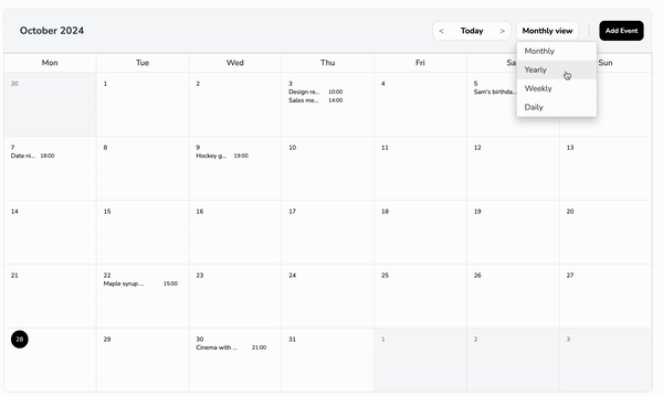
Key Features
- Monthly View: Displays a complete month with days and events.
- Current Day Highlighting: Highlights the current day with a circular background.
- Event Handling:
- Events are displayed under each day.
- Event titles are truncated with ellipses to prevent overflow.
- Each event occupies a single line, with the title taking up 60% of the width and the time taking up 40%.
- Responsive Design: Adjusts the layout and font size based on screen size to maintain readability and usability.
- Customizable Title and Button: Allows setting custom titles for the calendar and the "Add Event" button.
Table of Contents
Installation
Install the @farango/calendar_library package:
npm install @farango/calendar_libraryBasic Usage
Here's how to use the EventCalendar component with default settings:
import React from 'react';
import { EventCalendar } from '@farango/calendar_library';

const App = () => {
  const events = [
    { date: '2024-10-21', title: 'Meeting', time: '10:00 AM' },
    { date: '2024-10-22', title: 'Workshop', time: '2:00 PM' },
    { date: '2024-10-23', title: 'Webinar', time: '11:00 AM' },
  ];

  return (
    <div>
      <EventCalendar eventsData={events} />
    </div>
  );
};

export default App;
Customizing Styles
| Property | Description | Default |
|---|---|---|
colorActualDay |
Sets the background color of the current day. | #FFC107 |
colorFontTitle |
Changes the font color of the calendar title. | #1E90FF |
colorFontButtons |
Changes the font color of buttons. | #2ECC71 |
colorFontNameDays |
Changes the font color of the day names (Mon, Tue, etc.). | #34495E |
colorFontDays |
Changes the font color of the calendar days. | #000 |
sizeFontAppointment |
Adjusts the font size of event titles. | 1rem |
sizeFontButtons |
Adjusts the font size of buttons. | 0.9rem |
sizeFontNameDays |
Adjusts the font size of the day names. | 0.8rem |
sizeFontDays |
Adjusts the font size of the calendar days. | 0.85rem |
bgHeader |
Sets the background color of the header. | #E0E0E0 |
bgDaysNames |
Sets the background color of the day names row. | #F8F8F8 |
bgCells |
Sets the background color of the calendar cells. | #FFFFFF |
bgActualDay |
Sets the background color of the current day. | #FFC107 |
eventNumberBackground |
Sets the background color of the number of events. | #FFC107 |
eventTitleSpacing |
Adjusts spacing between event titles and their times. | '' (default) |
eventTimeColor |
Sets the font color of event times. | #000 |
eventTitleColor |
Sets the font color of event titles. | #000 |
You can customize the appearance of the calendar by passing a styles object as a prop:
const customStyles = {
  colorActualDay: '#FF5733',
  colorFontTitle: '#1E90FF',
  colorFontButtons: '#2ECC71',
  colorFontNameDays: '#34495E',
  colorFontDays: '#000',
  sizeFontAppointment: '1rem',
  sizeFontButtons: '0.9rem',
  sizeFontNameDays: '0.8rem',
  sizeFontDays: '0.85rem',
  bgHeader: '#E0E0E0',
  bgDaysNames: '#F8F8F8',
  bgCells: '#FFFFFF',
  bgActualDay: '#FFC107',
  visibilityOptions: {
    todayButton: true,
    dropdownFilter: true,
    addEventButton: false,
    header: true,
    daysNames: true,
  },
};

<EventCalendar eventsData={events} styles={customStyles} />
Visibility Options
The component allows you to toggle visibility for specific elements:
- todayButton: Shows/hides the "Today" button.
- dropdownFilter: Shows/hides the filter dropdown.
- addEventButton: Shows/hides the "Add Event" button.
- header: Shows/hides the calendar header.
- daysNames: Shows/hides the row of day names.
Additional Props
title
- Type: String
- Default:
"Event Calendar" - Description: Sets a custom title for the calendar.
- Example:
<EventCalendar title="My Custom Calendar" />
titleButton
- Type: String
- Default:
"Add Event" - Description: Sets a custom label for the "Add Event" button.
- Example:
<EventCalendar titleButton="Create New Event" />
onSelectedEvent
- Type: Function
- Default:
() => {} - Description: Callback function triggered when an event is selected.
Example:
const handleEventSelection = (event) => {
  console.log('Selected Event:', event);
};

<EventCalendar onSelectedEvent={handleEventSelection} />
addEvent
- Type: Function
- Default:
() => {} - Description: Callback function triggered when the "Add Event" button is clicked.
Example:
const handleAddEvent = () => {
  console.log('Add Event clicked');
};

<EventCalendar addEvent={handleAddEvent} />
Props
eventsData
- Type: Array
- Default:
[] Description: An array of event objects. Each event should have:
date(in YYYY-MM-DD format)title(string)time(string)
Example:
const events = [
  { date: '2024-10-21', title: 'Meeting', time: '10:00 AM', numberEvents:2 },
  { date: '2024-10-22', title: 'Workshop', time: '2:00 PM' },
];
styles
- Type: Object
- Default: See
defaultStylesin the component - Description: An object to customize the appearance of the calendar. It contains properties for colors, font sizes, background colors, and visibility options.
Examples
Example 1: Simple Calendar with Default Styles
<EventCalendar eventsData={events} />Example 2: Calendar with Custom Styles
<EventCalendar eventsData={events} styles={customStyles} />Example 3: Custom Title and Add Event Callback
<EventCalendar
  title="Team Calendar"
  titleButton="Schedule Event"
  addEvent={() => alert('Add Event clicked')}
/>
AvailabilityView Component Documentation
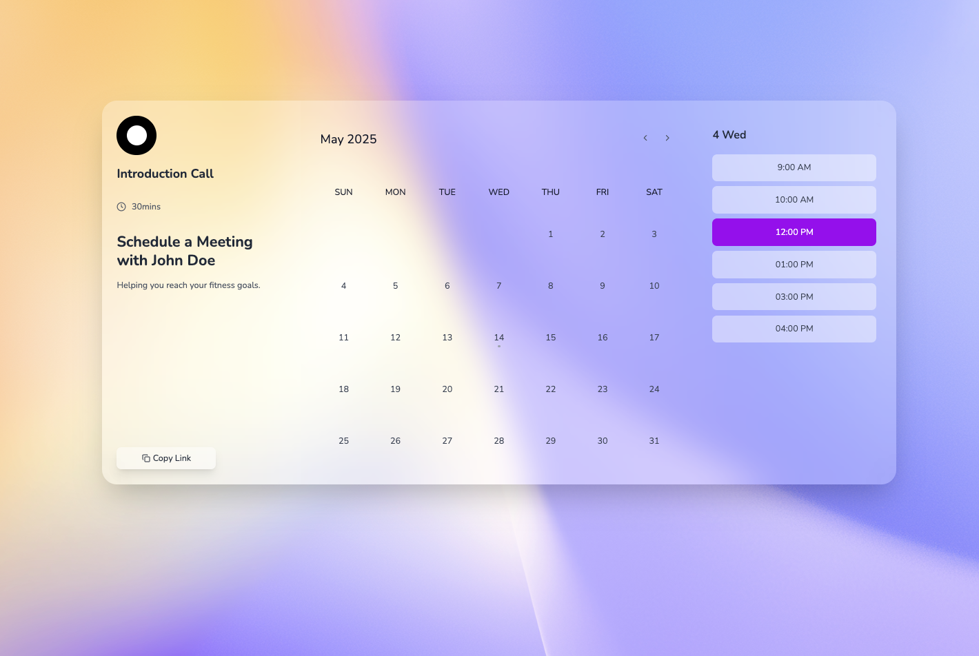
Overview
The AvailabilityView component is an enhanced React-based booking calendar interface that combines a monthly calendar view, time slot selection, and user profile information. It provides a complete booking experience with form validation and extensive customization options while maintaining backward compatibility.
Key Features
- Monthly Calendar View: Interactive calendar with date selection
- Time Slot Management: Display and select available time slots
- Profile Section: Showcase service provider information
- Booking Form: Integrated form with validation
- Full Customization: Extensive styling and behavioral options
- Responsive Design: Mobile-friendly layouts
- Date Restrictions: Control selectable date ranges
- Zero Breaking Changes: 100% backward compatible
Installation
npm install @farango/calendar_libraryBasic Usage
import React from 'react';
import { AvailabilityView } from '@farango/calendar_library';

const App = () => {
  return (
    <AvailabilityView />
  );
};

export default App;
Props
Core Props
| Prop | Type | Default | Description |
|---|---|---|---|
date |
Date | null |
Pre-selected date |
time |
string | null |
Pre-selected time slot |
availability |
Array | Default slots | Available time slots (array of strings or objects) |
profileInfo |
Object | Default profile | Service provider information |
onGoBack |
Function | undefined |
Callback when back button is clicked |
handleTimeSlotSelect |
Function | Console log | Callback when time slot is selected |
handleFormSubmit |
Function | Console log | Callback when booking form is submitted |
CustomForm |
Component | BookingForm |
Custom form component |
initialValues |
Object | {} |
Initial form field values |
Customization Props
| Prop | Type | Default | Description |
|---|---|---|---|
theme |
Object | {} |
Theme configuration object |
customClasses |
Object | {} |
Override component CSS classes |
layout |
Object | {profileCols: 3, calendarCols: 6, timeSlotsCols: 3} |
Grid column distribution |
animations |
Object | {enabled: true, duration: "cal-transition-all"} |
Animation settings |
calendarProps |
Object | {} |
Props passed to CalendarSection |
timeSlotProps |
Object | {} |
Props passed to TimeSlotSection |
profileProps |
Object | {} |
Props passed to ProfileSection |
formProps |
Object | {} |
Props passed to BookingForm |
Date Management Props
| Prop | Type | Default | Description |
|---|---|---|---|
minDate |
Date | null |
Minimum selectable date |
maxDate |
Date | null |
Maximum selectable date |
disabledDates |
Array | [] |
Array of dates to disable |
highlightedDates |
Array | [] |
Array of dates to highlight |
Event Handlers
| Prop | Type | Description |
|---|---|---|
onDateChange |
Function | Called when date selection changes |
onTimeChange |
Function | Called when time selection changes |
validationRules |
Object | Custom validation functions for form fields |
Data Structures
Profile Info Object
const profileInfo = {
  image: "https://example.com/avatar.jpg",
  name: "John Doe",
  service: "Consultation",
  subtitle: "Professional Consultant",
  meetingLink: "https://example.com/meeting",
  meetingLongTime: "30 minutes",
  shortText: "Brief description of the service"
};
Availability Array
// Simple array of time strings
const availability = ["9:00 AM", "10:00 AM", "11:00 AM", "2:00 PM"];

// Or array of objects with availability status
const availability = [
  { time: "9:00 AM", available: true },
  { time: "10:00 AM", available: false },
  { time: "11:00 AM", available: true }
];
Examples
Example 1: Basic Implementation
import { AvailabilityView } from '@farango/calendar_library';

function BasicCalendar() {
  return <AvailabilityView />;
}
Example 2: With Custom Profile and Availability
function CustomCalendar() {
  const profile = {
    image: "https://example.com/doctor.jpg",
    name: "Dr. Smith",
    service: "Medical Consultation",
    subtitle: "General Practitioner",
    meetingLongTime: "45 minutes",
    shortText: "Professional medical consultation"
  };

  const availability = [
    "9:00 AM", "10:00 AM", "11:00 AM",
    "2:00 PM", "3:00 PM", "4:00 PM"
  ];

  return (
    <AvailabilityView
      profileInfo={profile}
      availability={availability}
      handleFormSubmit={(data) => {
        console.log('Booking submitted:', data);
      }}
    />
  );
}
Example 3: With Date Restrictions
function RestrictedCalendar() {
  const today = new Date();
  const maxDate = new Date();
  maxDate.setMonth(maxDate.getMonth() + 2); // 2 months ahead

  return (
    <AvailabilityView
      minDate={today}
      maxDate={maxDate}
      disabledDates={[
        new Date(2025, 0, 25), // Christmas
        new Date(2025, 0, 1)   // New Year
      ]}
    />
  );
}
Example 4: With Custom Styling
function StyledCalendar() {
  return (
    <AvailabilityView
      customClasses={{
        wrapper: "cal-bg-gradient-to-br cal-from-blue-50 cal-to-purple-50",
        container: "cal-shadow-2xl",
        profileSection: {
          copyButton: "cal-bg-blue-600 hover:cal-bg-blue-700 cal-text-white"
        }
      }}
      layout={{
        profileCols: 4,
        calendarCols: 5,
        timeSlotsCols: 3
      }}
    />
  );
}
Example 5: With Form Customization
function CustomFormCalendar() {
  return (
    <AvailabilityView
      formProps={{
        customFields: [
          {
            name: 'phone',
            label: 'Phone Number',
            placeholder: '+1 (555) 000-0000',
            type: 'tel',
            required: true
          },
          {
            name: 'reason',
            label: 'Reason for appointment',
            type: 'textarea',
            rows: 3,
            required: true
          }
        ],
        submitButtonText: 'Book Appointment',
        showTerms: true
      }}
      validationRules={{
        email: (value) => {
          if (!value) return "Email is required";
          if (!/^[^\s@]+@[^\s@]+\.[^\s@]+$/.test(value)) {
            return "Please enter a valid email";
          }
          return null;
        }
      }}
    />
  );
}
Example 6: With Advanced Features
function AdvancedCalendar() {
  const [bookings, setBookings] = useState([]);

  return (
    <AvailabilityView
      // Time slot grouping
      timeSlotProps={{
        groupTimeSlots: true,
        timeSlotGroups: {
          morning: { label: 'Morning', range: [0, 12] },
          afternoon: { label: 'Afternoon', range: [12, 17] },
          evening: { label: 'Evening', range: [17, 24] }
        }
      }}

      // Calendar customization
      calendarProps={{
        weekDays: ['S', 'M', 'T', 'W', 'T', 'F', 'S'],
        disablePastDays: true
      }}

      // Profile enhancement
      profileProps={{
        additionalInfo: [
          { icon: '📍', text: 'Online Meeting' },
          { icon: '💰', text: 'Free Consultation' }
        ],
        customButtons: [{
          label: 'View Full Profile',
          onClick: () => window.open('/profile', '_blank')
        }]
      }}

      // Form submission
      handleFormSubmit={async (data) => {
        try {
          // Your API call here
          const response = await api.createBooking(data);
          setBookings([...bookings, response]);
          alert('Booking confirmed!');
        } catch (error) {
          alert('Booking failed. Please try again.');
        }
      }}

      // Event handlers
      onDateChange={(date) => console.log('Date selected:', date)}
      onTimeChange={(time) => console.log('Time selected:', time)}
    />
  );
}
Customization Guide
Custom Classes Structure
const customClasses = {
  // Main wrappers
  wrapper: "custom-wrapper-class",
  container: "custom-container-class",
  grid: "custom-grid-class",

  // Section wrappers
  profile: "custom-profile-wrapper",
  calendar: "custom-calendar-wrapper",
  timeSlots: "custom-timeslots-wrapper",

  // Component-specific classes
  profileSection: {
    container: "custom-profile-container",
    image: "custom-image-class",
    copyButton: "custom-copy-button"
  },
  calendarSection: {
    container: "custom-calendar-container",
    dayButton: "custom-day-button",
    dayButtonSelected: "custom-selected-day"
  },
  timeSlotsSection: {
    container: "custom-slots-container",
    slotButton: "custom-slot-button",
    slotButtonSelected: "custom-selected-slot"
  },
  form: {
    container: "custom-form-container",
    confirmButton: "custom-confirm-btn"
  }
};
Theme Structure
const customTheme = {
  colors: {
    primary: "purple",
    secondary: "gray",
    accent: "pink",
    text: {
      primary: "gray-900",
      secondary: "gray-700",
      muted: "gray-600"
    }
  },
  animations: {
    transition: "cal-transition-all",
    duration: "cal-duration-300",
    easing: "cal-ease-in-out"
  }
};
Best Practices
Start Simple: Begin with the default implementation and add customizations as needed.
Use Custom Classes: For styling changes, use
customClassesinstead of modifying components.Implement Validation: Add custom validation rules for better user experience.
Handle Errors: Always implement error handling in
handleFormSubmit.Test Responsiveness: The component is responsive by default, but test custom layouts on different screen sizes.
Default Values
All defaults are centralized in the utils.js file:
// Default time slots
export const defaultAvailability = [
  "9:00 AM", "10:00 AM", "11:00 AM", "12:00 PM",
  "1:00 PM", "2:00 PM", "3:00 PM", "4:00 PM"
];

// Default profile
export const defaultProfile = {
  image: "https://avatars.githubusercontent.com/u/146370544?v=4",
  name: "John Doe",
  service: "EVO Introduction Call",
  subtitle: "Fitness Coach",
  meetingLink: "https://example.com",
  meetingLongTime: "30 minutes",
  shortText: "Helping you reach your fitness goals."
};
Migration Guide
If you're upgrading from a previous version:
- No Breaking Changes: The component maintains 100% backward compatibility.
- New Features Are Optional: All new props are optional with sensible defaults.
- Gradual Enhancement: You can gradually add customizations without changing existing code.
Troubleshooting
Common Issues
- Time slots not showing: Ensure your availability array is properly formatted.
- Form validation not working: Check that your validation functions return
nullfor valid inputs. - Custom classes not applying: Verify you're using the correct nested structure for
customClasses.
Support
For issues and feature requests, please visit the GitHub repository.
License
MIT License
Author
Andrés Arango