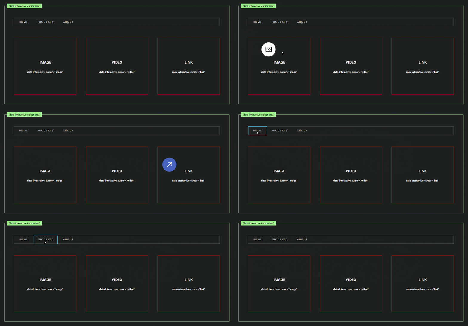
InteractiveCursor Component
The InteractiveCursor is a Svelte 5 component that provides a customizable, interactive cursor effect. It dynamically changes its position and size based on user interactions within specified trigger areas. This component is ideal for enhancing user experiences with visually engaging cursor animations.
Live Demo

Installation
You can install the InteractiveCursor component using npm or pnpm:
Using npm
npm install @lostisworld/svelte-interactive-cursorUsing pnpm
pnpm add @lostisworld/svelte-interactive-cursorFeatures
- Dynamic Resizing: The cursor adjusts its size and position dynamically when hovering over elements specified in the
useDataElementRectproperty. - Scaling on Interaction: Scale transformations can be applied to the cursor when hovering over specified elements using
scaleOnActive. - Animation Control: Smooth animations with customizable duration using CSS transitions and
KeyframeAnimationOptions. - Custom Icons: Allows custom rendering inside the cursor element using the
childrenproperty. - State Exposure: Exposes
activeDataValueto track the active interactive element and its name dynamically. - Responsive Design: Automatically disables the interactive cursor for small screens or when reduced motion is preferred.
Types
ScaleOnActiveElement
type ScaleOnActiveElement = {
    element: string; // The name of the element (value of `data-interactive-cursor`).
    scaleMultiplicator?: number; // Scale factor to apply when the element is active.
};
InteractiveCursorOptions
interface InteractiveCursorOptions {
    defaultSize?: number; // Default cursor size in pixels.
    scaleOnActive?: ScaleOnActiveElement[]; // Elements with scale factors.
    duration?: number; // Animation duration in milliseconds.
    useDataElementRect?: string[]; // Elements that trigger cursor resizing.
}
Usage
Basic Setup
Import the InteractiveCursor component and include it in your Svelte application:
<script lang="ts">
    import InteractiveCursor from '@lostisworld/svelte-interactive-cursor';
</script>

<div data-interactive-cursor-area>
    <button data-interactive-cursor="btn">Hover me!</button>
</div>

<InteractiveCursor
    defaultSize={40}
    duration={300}
    scaleOnActive={[{ element: 'btn', scaleMultiplicator: 2 }]}
    useDataElementRect={['btn']}
/>
Advanced Example
Here is an example with custom cursor behavior and styles:
<script lang="ts">
    import InteractiveCursor, {
        type ScaleOnActiveElement
    } from '@lostisworld/svelte-interactive-cursor';

    let currentCursorState = $state({ activeDataName: '', activeDataElement: null });

    // Custom cursor props
    const scaleOnActive: ScaleOnActiveElement[] = [
        { element: 'image' },
        { element: 'video', scaleMultiplicator: 4 },
        { element: 'link' },
        { element: 'mixblend', scaleMultiplicator: 8 },
        { element: 'prevslide', scaleMultiplicator: 5 },
        { element: 'nextslide', scaleMultiplicator: 5 }
    ];

    const customCursorProps = [
        { data: 'image', icon: '<svg>...</svg>' },
        { data: 'video', icon: '<svg>...</svg>', cursorClass: 'bg-red-500 text-white' },
        { data: 'link', icon: '<svg>...</svg>', cursorClass: 'bg-sky-500 text-white' },
        { data: 'tablist', cursorClass: 'rounded-none outline outline-2 outline-purple-500' }
    ];
</script>

<div>
    <!-- Interactive Cursor Target Areas -->
    <section data-interactive-cursor-area>
        <div data-interactive-cursor="image">Image</div>
        <div data-interactive-cursor="video">Video</div>
        <div data-interactive-cursor="link">Link</div>
        <ul data-interactive-cursor="tablist">
            <li>Tab 1</li>
            <li>Tab 2</li>
        </ul>
    </section>

    <!-- Interactive Cursor Component -->
    <InteractiveCursor
        bind:activeDataValue={currentCursorState}
        {scaleOnActive}
        useDataElementRect={['tablist']}
        class="rounded-full flex items-center justify-center {currentCursorState.activeDataName === ''
            ? 'bg-white text-black'
            : customCursorProps.find((state) => state.data === currentCursorState.activeDataName)
                    ?.cursorClass || 'bg-white text-black'}"
    >
        {#each customCursorProps as { icon, data }}
            {#if data === currentCursorState.activeDataName && icon}
                {@html icon}
            {/if}
        {/each}
    </InteractiveCursor>
</div>
Component Props
| Property | Type | Default | Description |
|---|---|---|---|
defaultSize |
number |
32 |
The default size (in pixels) of the cursor. |
scaleOnActive |
ScaleOnActiveElement[] |
[] |
Array of objects specifying elements and their respective scaling factors. |
duration |
number |
500 |
Duration of the cursor's animation in milliseconds. |
useDataElementRect |
string[] |
[] |
Array of element names (matched by data-interactive-cursor) for which the cursor dynamically resizes and aligns to their bounding rectangle. |
class |
string |
'' |
Additional classes to apply to the cursor element. |
children |
Snippet |
undefined |
Custom content to render inside the cursor. |
activeDataValue |
{ activeDataName: string; activeDataElement: HTMLElement } |
{ activeDataName: '', activeDataElement: null } |
Tracks the currently active interactive element's name and DOM reference. |
Data Attributes
Cursor Areas
- Add
data-interactive-cursor-areato define areas where the cursor can interact. - Add
data-interactive-cursor="value"to target specific elements and associate them with custom cursor behaviors.
Example:
<div data-interactive-cursor-area>
    <div data-interactive-cursor="image">Image Element</div>
    <div data-interactive-cursor="video">Video Element</div>
</div>
Scaling on Specific Elements
To make the cursor scale when hovering over specific elements, define those elements using the data-interactive-cursor attribute.
<main data-interactive-cursor-area>
    <button data-interactive-cursor="button">Hover Me</button>
    <InteractiveCursor
        defaultSize={50}
        scaleOnActive={[{ element: 'button', scaleMultiplicator: 2 }]}
    />
</main>
Adapting to Element Size
Enable the cursor to adapt its size and position to match specific elements.
<main data-interactive-cursor-area>
    <div class="card" data-interactive-cursor="card">Hover me!</div>
    <InteractiveCursor useDataElementRect={['card']} />
</main>
Styling
The InteractiveCursor component includes default styles that can be customized using the class prop or overriding CSS variables.
Default Classes
.lw-interactive-cursor: Base cursor styles..lw-interactive-cursor.active: Active state styles.
Example Custom Styles
.lw-interactive-cursor {
    background-color: white;
    color: black;
}
.lw-interactive-cursor.active {
    background-color: blue;
    color: white;
}
Helper Function: interactiveCursor
For advanced customization, you can use the interactiveCursor function to programmatically control the cursor.
Parameters
| Parameter | Type | Description |
|---|---|---|
cursor |
HTMLElement |
Reference to the cursor DOM element. |
options |
InteractiveCursorOptions |
Configuration options for the cursor (see table below). |
Configuration Options
| Option | Type | Default | Description |
|---|---|---|---|
defaultSize |
number |
32 |
Default cursor size in pixels. |
scaleOnActive |
ScaleOnActiveElement[] |
[] |
Elements that trigger scaling when hovered over. |
duration |
number |
500 |
Animation duration in milliseconds. |
useDataElementRect |
string[] |
[] |
Elements for which bounding rect sizes should be used. |
Events and Methods
Properties
isActive: Boolean indicating whether the cursor is currently active.activeDataValue: Tracks the currentdata-interactive-cursorname and element.
Methods
init(): Initializes event listeners and cursor tracking.destroy(): Cleans up event listeners and animations.
Notes
- Reduced Motion: Automatically disables animations for users with reduced motion preferences.
- Responsive Design: Disables the interactive cursor on smaller screens (e.g., mobile devices).
- Always ensure the
data-interactive-cursor-areaattribute is present on interactive parent elements.
This documentation provides clear guidance on integrating and customizing the InteractiveCursor component for a variety of use cases. Let me know if you'd like further refinements!
Contributing
Contributions are welcome! Please ensure all changes are well-documented and tested.
- Fork the repository.
- Create a new branch for your feature or bugfix.
- Commit your changes with clear and descriptive messages.
- Submit a pull request.
License
This project is licensed under the MIT License.
Here’s the updated documentation for your InteractiveCursor component based on the provided code: