 storybookjs
Icons
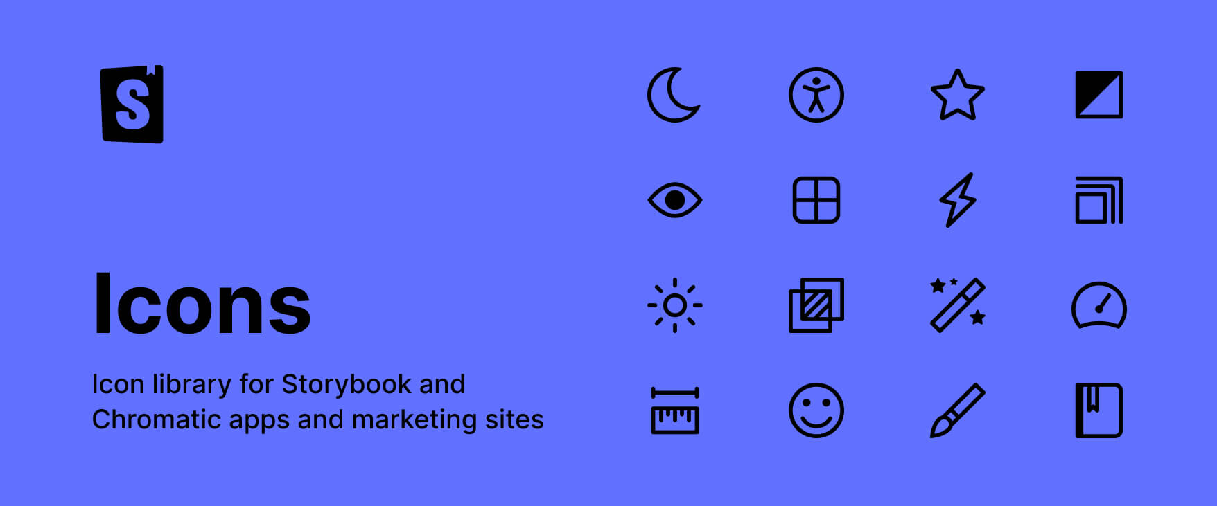
This library contains the icons used in Storybook and Chromatic apps and marketing sites. They are 14x14. To view the list of all available icons, please go to https://main--64b56e737c0aeefed9d5e675.chromatic.com/
Install
npm:
npm install @storybook/iconsyarn:
yarn add @storybook/iconspnpm:
pnpm add @storybook/iconsTo Do
- <input checked="" disabled="" type="checkbox"> Export every single icon instead of a single component
- <input checked="" disabled="" type="checkbox"> Add stories for each component
Generating new icons from Figma
First, set local environment variables:
FIGMA_API_TOKEN=<YOUR_FIGMA_API_TOKEN>
FIGMA_FILE_ID=<FIGMA_FILE_ID>
FIGMA_CANVAS=Icons
Then, fetch all icons from Figma locally and create React components + stories automatically:
pnpm generate-iconsInspired by this article.
Developing
Watch and rebuild code with tsup and run Storybook to preview your UI during development:
pnpm storybookBuilding
Build package with tsup for production:
pnpm build