 CarlosNZ
json-edit-react
A highly-configurable React component for editing or viewing JSON/object data
Explore the Demo


Features include:
- ✅ Easy inline editing of individual values or whole blocks of JSON text
- 🔒 Granular control – restrict edits, deletions, or additions per element
- 📏 JSON Schema validation (using 3rd-party validation library)
- 🎨 Customisable UI — built-in or custom themes, CSS overrides or targeted classes
- 📦 Self-contained — plain HTML/CSS, so no dependence on external UI libraries
- 🔍 Search & filter — find data by key, value or custom function
- 🚧 Custom components — replace specific nodes with specialised components (e.g. date picker, links, images,
undefined,BigInt,Symbol) - 🌏 Localisation — easily translate UI labels and messages
- 🔄 Drag-n-drop re-ordering within objects/arrays
- 🎹 Keyboard customisation — define your own key bindings
- 🎮 External control via callbacks and triggers
💡 Try the Live Demo to see these features in action!
[!IMPORTANT] Breaking changes:
- Version 1.19.0 has a change to the
themeinput. Built-in themes must now be imported separately and passed in, rather than just naming the theme as a string. This is better for tree-shaking, so unused themes won't be bundled with your build. See Themes & Styles.- Version 1.14.0 has a change which recommends you provide a
setDataprop and not useonUpdatefor updating your data externally. See Managing state.
Contents
- Installation
- Implementation
- Usage
- Props Reference
- Managing State
- Update Functions
- Advanced Editing Control
- Full object editing
- Search/Filtering
- Themes & Styles
- Localisation
- Custom Nodes
- Custom Text
- Custom Buttons
- Keyboard customisation
- External control
- Undo functionality
- Exported helpers
- Issues, bugs, suggestions?
- Roadmap
- Inspiration
- Changelog
Installation
# Depending on your package manager:

npm i json-edit-react
# OR
yarn add json-edit-react
Implementation
import { JsonEditor } from 'json-edit-react'

// In your React component:
return (
  <JsonEditor
    data={ jsonData }
    setData={ setJsonData } // optional
    { ...otherProps } />
);
Usage
(for end user)
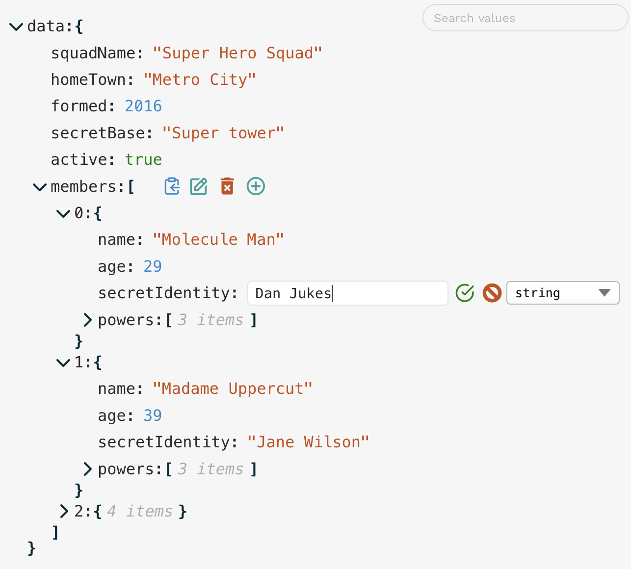
It's pretty self explanatory (click the "edit" icon to edit, etc.), but there are a few not-so-obvious ways of interacting with the editor:
- Double-click a value (or a key) to edit it
- When editing a string, use
Cmd/Ctrl/Shift-Enterto add a new line (Entersubmits the value) - It's the opposite when editing a full object/array node (which you do by clicking "edit" on an object or array value) —
Enterfor new line, andCmd/Ctrl/Shift-Enterfor submit Escapeto cancel editing- When clicking the "clipboard" icon, holding down
Cmd/Ctrlwill copy the path to the selected node rather than its value - When opening/closing a node, hold down "Alt/Option" to open/close all child nodes at once
- For Number inputs, arrow-up and down keys will increment/decrement the value
- For Boolean inputs, space bar will toggle the value
- Easily navigate to the next or previous node for editing using the
Tab/Shift-Tabkeys. - Drag and drop items to change the structure or modify display order
- When editing is not permitted, double-clicking a string value will expand the text to the full value if it is truncated due to length (there is also a clickable "..." for long strings)
- JSON text input can accept "looser" input, if an additional JSON parsing method is provided (e.g. JSON5). See
jsonParseprop.
Have a play with the Demo app to get a feel for it!
Props Reference
The only required property is data (although you will need to provide a setData method to update your data).
This is a reference list of all possible props, divided into related sections. Most of them provide a link to a section below in which the concepts are explored in more detail.
Data Management
</summary>| Prop | Type | Default | Description |
|---|---|---|---|
data |
object|array |
none | The data to be displayed / edited |
setData |
object|array => void |
none | Method to update your data object. See Managing state below for additional notes. |
onUpdate |
UpdateFunction |
none | A function to run whenever a value is updated (edit, delete or add) in the editor. See Update functions. |
onEdit |
UpdateFunction |
none | A function to run whenever a value is edited. |
onDelete |
UpdateFunction |
none | A function to run whenever a value is deleted. |
onAdd |
UpdateFunction |
none | A function to run whenever a new property is added. |
onChange |
OnChangeFunction |
none | A function to modify/constrain user input as they type — see OnChange functions. |
onError |
OnErrorFunction |
none | A function to run whenever the component reports an error — see OnErrorFunction. |
enableClipboard |
boolean|CopyFunction |
true |
Enable or disable the "Copy to clipboard" button in the UI. — see Copy Function |
Restricting Editing
</summary>| Prop | Type | Default | Description |
|---|---|---|---|
restrictEdit |
boolean|FilterFunction |
false |
If true, no editing at all is permitted. A callback function can be provided — see Advanced Editing Control |
restrictDelete |
boolean|FilterFunction |
false |
As with restrictEdit but for deletion |
restrictAdd |
boolean|FilterFunction |
false |
As with restrictEdit but for adding new properties |
restrictTypeSelection |
boolean|DataType[]|TypeFilterFunction |
false |
For restricting the data types the user can select, including Custom Node types, and Enums — see Data Type Restrictions |
newKeyOptions |
string[] | NewKeyOptionsFunction |
none | New keys can be restricted to certain values — see New Key Restrictions & Default Values |
defaultValue |
any|DefaultValueFilterFunction |
null |
Value that new properties are initialised with — see New Key Restrictions & Default Values |
restrictDrag |
boolean|FilterFunction |
true |
Set to false to enable drag and drop functionality — see Drag-n-drop |
viewOnly |
boolean |
| A shorthand if you just want the component to be a viewer, with no editing at all. Overrides any of the above edit restrictions. |
Look and Feel / UI
</summary>| Prop | Type | Default | Description |
|---|---|---|---|
theme |
ThemeInput |
defaultTheme |
Either one of the built-in themes (imported separately), or an object specifying some or all theme properties — see Themes. |
icons |
{[iconName]: JSX.Element, ... } |
{ } |
Replace the built-in icons by specifying them here — see Themes. |
showIconTooltips |
boolean |
false | Display icon tooltips when hovering. |
indent |
number |
3 |
Specify the amount of indentation for each level of nesting in the displayed data. |
collapse |
boolean|number|FilterFunction |
false |
Defines which nodes of the JSON tree will be displayed "opened" in the UI on load — see Collapse. |
collapseAnimationTime |
number |
300 |
Time (in milliseconds) for the transition animation when collapsing collection nodes. |
collapseClickZones |
Array<"left" | "header" | "property"> |
["left", "header"] |
Aside from the ⌄ icon, you can specify other regions of the UI to be clickable for collapsing/opening a collection. |
rootName |
string |
"data" |
A name to display in the editor as the root of the data object. |
showArrayIndices |
boolean |
true |
Whether or not to display the index (as a property key) for array elements. |
showStringQuotes |
boolean |
true |
Whether or not to display string values in "quotes". |
showCollectionCount |
boolean|"when-closed" |
true |
Whether or not to display the number of items in each collection (object or array). |
stringTruncate |
number |
250 |
String values longer than this many characters will be displayed truncated (with ...). The full string will always be visible when editing. |
keySort |
boolean|CompareFunction |
false |
If true, object keys will be ordered (using default JS .sort()). A compare function can also be provided to define sorting behaviour, except the input type should be a tuple of the key and the value of a node i.e. (a: [string | number, ValueData], b: [string | number, ValueData]) => number |
minWidth |
number|string (CSS value) |
250 |
Minimum width for the editor container. |
maxWidth |
number|string (CSS value) |
600 |
Maximum width for the editor container. |
rootFontSize |
number|string (CSS value) |
16px |
The "base" font size from which all other sizings are derived (in ems). By changing this you will scale the entire component. |
insertAtTop |
boolean| "object | "array" |
false |
If true, inserts new values at the top rather than bottom. Can set the behaviour just for arrays or objects by setting to "object" or "array" respectively. |
errorMessageTimeout |
number |
2500 |
Time (in milliseconds) to display the error message in the UI. |
showErrorMessages |
boolean |
true |
Whether or not the component should display its own error messages (you'd probably only want to disable this if you provided your own onError function) |
| <summary> |
Search and Filtering
</summary>| Prop | Type | Default | Description |
|---|---|---|---|
searchText |
string |
undefined |
Data visibility will be filtered by matching against value, using the method defined below in searchFilter |
searchFilter |
"key"|"value"|"all"|SearchFilterFunction |
undefined |
Define how searchText should be matched to filter the visible items — see Search/Filtering |
searchDebounceTime |
number |
350 |
Debounce time when searchText changes |
Custom components & overrides (incl. Localisation)
</summary>| Prop | Type | Default | Description |
|---|---|---|---|
customNodeDefinitions |
CustomNodeDefinition[] |
| You can provide custom React components to override specific nodes in the data tree, according to a condition function — see Custom nodes. (A simple custom component to turn url strings into active links is provided in the main package — see here) | |
customButtons |
CustomButtonDefinition[] |
[] |
You can add your own buttons to the Edit Buttons panel if you'd like to be able to perform a custom operation on the data — see Custom Buttons |
translations |
LocalisedStrings object |
{ } |
UI strings (such as error messages) can be translated by passing an object containing localised string values (there are only a few) — see Localisation |
customText |
CustomTextDefinitions |
| In addition to localising the component text strings, you can also dynamically alter them, depending on the data — see Custom Text | |
TextEditor |
ReactComponent<TextEditorProps> |
| Pass a component to offer a custom text/code editor when editing full JSON object as text. See details | |
jsonParse |
(input: string) => JsonData |
JSON.parse |
Provide an alternative JSON parser (e.g. JSON5), to allow "looser" text input when editing JSON blocks. |
jsonStringify |
(data: JsonData) => string |
(data) => JSON.stringify(data, null, 2) |
Similarly, you can override the presentation of the text when editing JSON. You can supply different formatting parameters to the native JSON.stringify(), or provide a third-party option, like the aforementioned JSON5. |
keyboardControls |
KeyboardControls |
As explained above | Override some or all of the keyboard controls — see Keyboard customisation |
External control
</summary>More detail below
| Prop | Type | Default | Description |
|---|---|---|---|
onEditEvent |
OnEditEventFunction |
none | Callback to execute whenever the user starts or stops editing a node |
onCollapse |
OnCollapseFunction |
none | Callback to execute whenever the user collapses or opens a node |
externalTriggers |
ExternalTriggers |
none | Specify a node to collapse/open, or to start/stop editing. See External control |
Miscellaneous
</summary>| Prop | Type | Default | Description |
|---|---|---|---|
id |
string |
none | Name for the HTML id attribute on the main component container. |
className |
string |
none | Name of a CSS class to apply to the overall component. In most cases, specifying theme properties will be more straightforward. |
Managing State
It is recommended that you manage the data state yourself outside this component — just pass in a setData method, which is called internally to update your data. However, this is not compulsory — if you don't provide a setData method, the data will be managed internally, which is fine if you're not really doing anything with the data. The alternative is to use the Update functions to update your data externally, but this is not recommended except in special circumstances as you can run into issues keeping your data in sync with the internal state (which is what is displayed), as well as unnecessary re-renders.
[!TIP] Update functions should ideally be used only for implementing side effects (e.g. notifications), validation, or mutating the data before setting it with
setData.
Update Functions
A callback to be executed whenever a data update (edit, delete or add) occurs can be provided. You might wish to use this to update some external state, make an API call, modify the data before saving it, or validate the data structure against a JSON schema.
If you want the same function for all updates, then just the onUpdate prop is sufficient. However, should you require something different for editing, deletion and addition, then you can provide separate Update functions via the onEdit, onDelete and onAdd props.
The function will receive the following object as a parameter:
{
    newData,      // data state after update
    currentData,  // data state before update
    newValue,     // the new value of the property being updated
    currentValue, // the current value of the property being updated
    name,         // name of the property being updated
    path          // full path to the property being updated,
                  //   as an array of property keys
                  //   (e.g. [ "user", "friends", 1, "name" ])
                  //   (equivalent to "user.friends[1].name")
}
The function can return nothing (in which case the data is updated normally), or a value to represent success/failure, error value, or modified data. The return value can be one of the following, and handled accordingly:
true/void/undefined: data continues update as normalfalse: considers the update to be an error, so data is not updated (reverts to previous value), and a generic error message is displayed in the UIstring: also considered an error, so no data update, but the UI error message will be your provided string[ "value", <value> ]: tells the component to use the returned<value>instead of the input data. You might use this to automatically modify user input -- for example, sorting an array, or inserting a timestamp field into an object.[ "error", <value> ]: same asstring, but in the longer tuple format.
OnChange Function
Similar to the Update functions, the onChange function is executed as the user input changes. You can use this to restrict or constrain user input -- e.g. limiting numbers to positive values, or preventing line breaks in strings. The function must return a value in order to update the user input field, so if no changes are to be made, just return it unmodified.
The input object is similar to the Update function input, but with no newData field (since this operation occurs before the data is updated).
Examples
</summary>- Restrict "age" inputs to positive values up to 100:
// in <JsonEditor /> props onChange = ({ newValue, name }) => { if (name === "age" && newValue < 0) return 0; if (name === "age" && newValue > 100) return 100; return newValue } - Only allow alphabetical or whitespace input for "name" field (including no line breaks):
onChange = ({ newValue, name }) => {
    if (name === 'name' && typeof newValue === "string")
      return newValue.replace(/[^a-zA-Z\s]|\n|\r/gm, '');
    return newValue;
  }
OnError Function
Normally, the component will display simple error messages whenever an error condition is detected (e.g. invalid JSON input, duplicate keys, or custom errors returned by the onUpdate functions)). However, you can provide your own onError callback in order to implement your own error UI, or run additional side effects. (In the former case, you'd probably want to disable the showErrorMessages prop, too.) The input is similar to the other callbacks:
{
    currentData,  // data state before update
    currentValue, // the current value of the property being updated
    errorValue,   // the erroneous value that failed to update the property
    name,         // name of the property being updated
    path,         // full path to the property being updated,
                  //   as an array of property keys
                  //   (e.g. [ "user", "friends", 1, "name" ] )
                  //   (equivalent to "user.friends[1].name"),
    error: {
      code,       // one of 'UPDATE_ERROR' | 'DELETE_ERROR' |
                  //   'ADD_ERROR' | 'INVALID_JSON' | 'KEY_EXISTS'
      message     // the (localised) error message that would be displayed
    }
}
[!NOTE] An example of a custom Error UI can be seen in the Demo with the "Custom Nodes" data set -- when you enter invalid JSON input a "Toast" notification is displayed instead of the normal component error message.
Copy Function
A similar callback can be run whenever an item is copied to the clipboard (if passed to the enableClipboard prop), but with a slightly different input object:
{
    key          // name of the property being copied
    path         // path to the property
    value        // the value copied to the clipboard
    type         // Either "path" or "value" depending on whether "Cmd/Ctrl" was pressed
    stringValue  // A nicely stringified version of `value`
                 // (i.e. what the clipboard actually receives)
    success      // true/false -- whether clipboard copy action actually succeeded
    errorMessage // Error detail if `success === false`
}
[!TIP] Since there is very little user feedback when clicking "Copy", a good idea would be to present some kind of notification (see Demo). There are situations (such as an insecure environment) where the browser won't actually permit any clipboard actions. In this case, the
successproperty will befalse, so you can handle it appropriately.
JSON Schema Validation
It's possible to do full JSON Schema validation by creating an Update Function that passes the data to a 3rd-party schema validation library (e.g. Ajv). This will then reject any invalid input, and display an error in the UI (or via a custom onError function). You can see an example of this in the Demo with the "JSON Schema Validation" data set (and the "Custom Nodes" data set).
An example onUpdate validation function (using Ajv) could be something like this:
import { JsonEditor } from 'json-edit-react'
import Ajv from 'ajv'
import schema from './my-json-schema.json'

// Put these outside React components:
const ajv = new Ajv()
const validate = ajv.compile(schema)

// Etc....

// In the React component:
return
  <JsonEditor
    data={ jsonData }
    onUpdate={ ({ newData }) => {
      const valid = validate(newData)
      if (!valid) {
        console.log('Errors', validate.errors)
        const errorMessage = validate.errors
          ?.map((error) => `${error.instancePath}${error.instancePath ? ': '
            : ''}${error.message}`)
          .join('\n')
        // Send detailed error message to an external UI element,
        // such as a "Toast" notification
         displayError({
          title: 'Not compliant with JSON Schema',
          description: errorMessage,
          status: 'error',
        })
        // This string returned to and displayed in json-edit-react UI
        return 'JSON Schema error'
      }
    }}
  { ...otherProps } />
Advanced Editing Control
As well as configuring which nodes of can be edited, deleted, or added to, you can also specify:
- the data types (if any) available to each node (including enums),
- a restricted set of available keys that can be added to a node,
- default values for specific nodes and data types,
- drag 'n' drop restrictions
- which nodes appear open or closed ("collapsed")
As outlined in the props list above, most of these props can take either:
- a
boolean(in which casetruemeans that edit mode is fully restricted,falsemeans no restrictions) - a
FilterFunctioncallback, which allows edit controls to be defined dynamically
The callback for each type of restriction is slightly different, so let's look at each in turn:
restrictEdit, restrictDelete & restrictAdd
[!TIP] As a shorthand, if you want to restrict all editing completely, you can just pass the
viewOnlyprop, which will supersede any other defined editing restrictions
These each take a boolean value, or a FilterFunction callback, with the following input parameter object:
{
    key,        // name of the property
    path,       // path to the property (as an array of property keys)
    level,      // depth of the property (with 0 being the root)
    index,      // index of the node within its collection (based on display order)
    value,      // value of the property
    size ,      // if a collection (object, array), the number of items
                //   (null for non-collections)
    parentData, // parent object containing the current node
    fullData    // the full (overall) data object
    collapsed   // whether or not the current node is in a
                // "collapsed" state (only for Collection nodes)
}
The callback must return a boolean value -- if true that node will not be editable.
[!TIP] There is no specific restriction function for editing object property names, but the node must return
falsefor bothrestrictEditandrestrictDelete(andrestrictAddfor collections), since changing a property name is equivalent to deleting a property and adding a new one.
Edit restriction examples
</summary>- A good case would be ensure your root node is not directly editable:
// in <JsonEditor /> props
restrictEdit = { ({ level }) => level === 0 }- Don't let the
idfield be edited:
restrictEdit = { ({ key }) => key === "id" }
// You'd probably want to include this in `restrictDelete` as well- Only individual properties can be deleted, not objects or arrays:
restrictDelete = { ({ size }) => size !== null }- The only collections that can have new items added are the "address" object and the "users" array:
restrictAdd = { ({ key }) => key !== "address" && key !== "users" }
// "Adding" is irrelevant for non-collection nodes
collapse
The collapse prop can take a boolean value, in which case the data is initialised with all nodes either closed (true) or open (false). However a number value is probably more useful here — this specifies a nesting depth after which nodes will be closed. A FilterFunction with the same signature as the edit restrictions can also be provided for more fine-grained control of the initial display state.
Data Type Restrictions
The restrictDataType prop can take either a boolean (true means data type can not be changed at all) or a (slightly different) FilterFunction as above, or an array of available data types. The core types are:
"string""number""boolean""null""object""array"
The data type array can also specify Custom Node types (as defined in the custom node's name prop), as well as Enum options (see Enums below).
Similarly, the FilterFunction for data types, while it takes the same input shape, can return either a simple boolean or an array of available types.
[!NOTE] If
restrictTypeSelectionreturns less than two available types for a given node, the "Type Selector" drop-down won't appear for that node.
Type restriction example
</summary>This restrictTypeSelection function defines the following restrictions:
stringvalues can only be changed to strings or objects (for nesting)nullis not allowed anywherebooleanvalues must remain boolean- data nested below the "user" field can be any simple property (i.e. not objects or arrays), and doesn't have to follow the above rules (except no "null")
restrictTypeSelection = { ({ path, value }) => {
  if (path.includes('user')) return ['string', 'number', 'boolean']
  if (typeof value === 'boolean') return false
  if (typeof value === 'string') return ['string', 'object']
  return ['string', 'number', 'boolean', 'array', 'object'] // no "null"
} }
Enums
By defining an Enum type, you can restrict the available values to a pre-defined list:
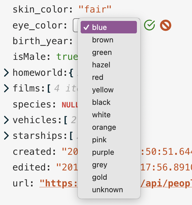
To define an Enum, just add an object with the following structure to your "Types" array (either directly in the prop, or returned from the callback):
{
  enum: "My Enum Type" // name that will appear in the Types selector drop-down
  values: [  // the list of allowed values
    "Option A",
    "Option B",
    "Option C"
  ]
  matchPriority: 1 // (Optional) used to recognize existing string values
                   //   as the particular type (see below)
}
What is matchPriority? Well, when the data object is initialised, we have no way to know whether a given string value is "just a string" or is supposed to be one of the values of an Enum type (and we don't want to assume that if it's listed somewhere in an Enum values list that it definitely should be restricted to that type). So, if matchPriority is not defined, then that Enum type will never be initially assigned to a potentially matching Enum value when editing. If matchPriority is defined, then the highest priority Enum that has the value in its values list will be assigned (so if multiple Enums have overlapping values, the one with the highest priority will be applied.).
If the type of a given node is going to be restricted to a particular Enum type (i.e. the restrictEditType prop returns only one value), then a matchPriority is essential, otherwise it wouldn't be possible to switch a string to that type.
You can see examples of this in the Star Wars data set of the Demo — the eye_color, skin_color, hair_color and films values are all restricted to a single, matching Enum type.
[!NOTE] When editing, once an Enum type is selected from the Types selector, that node will continue to be displayed as that type for subsequent edits in the same session -- the
matchPriorityis purely for automatic recognition of a given value as a specific type when first editing it.
Enum definition examples
</summary>- All nodes can be any of the standard data types plus a couple of custom Enum types:
restrictTypeSelection = [
  'string',
  'number',
  'boolean',
  'null',
  'object',
  'array',
  {
    enum: 'Weekday',
    values: ['Monday', 'Tuesday', 'Wednesday',
      'Thursday', 'Friday', 'Saturday', 'Sunday'],
    matchPriority: 1,
  },
  {
    enum: 'Colour',
    values: ['Red', 'Orange', 'Yellow', 'Green', 'Blue', 'Indigo', 'Violet'],
    matchPriority: 1,
  },
]
💡 TIP
For convenience, the core set of data types is exported from the package as
standardDataTypes, so the previous example could simply have been:restrictTypeSelection = [...standardDataTypes, ...enumDefinitionsAsAbove]
- Types cannot be changed on any node, and there is an Enum for "Eye colour" if the key matches:
restrictTypeSelection = ({ key }) => {
  if (key === 'eye_color')
    return [
      // Only one type returned, so can't be changed to another type
      {
        enum: 'Eye colour',
        values: ['blue', 'brown', 'green', 'hazel'],
        matchPriority: 1,
      },
    ]

  return true // No other node types can be changed either
}
New Key Restrictions & Default Values
You can restrict the available properties a given collection node can have (when adding new properties) by setting the newKeyOptions prop. The value can be either a list of keys, or a callback (with same input shape as the other FilterFunctions) returning the key list.
This will cause the UI to present a Drop-down selector when adding a new key rather than the usual text input:
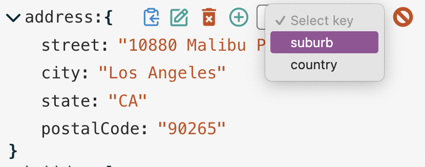
The initial value for newly-added keys can also be defined with the defaultValue prop -- this can be any value, or a callback returning any value. The input signature for the defaultValue callback is almost the same as the FilterFunctions, but it can take a second argument, which is the name of the new key.
You can see an example of this in the JSON Schema validation data of the Demo app when you add new keys to either the address collection or the root node.
Key restriction and Default value example:
</summary>- For an "address" node, only appropriate properties are available, with defaults for each:
newKeyOptions = ({ key }) => {
      if (key === 'address') return ['street', 'city', 'state', 'postalCode', 'country']
    },
defaultValue = (_, newKey) => { // Ignoring normal first parameter in this case
  switch (newKey) {
    case 'street':
      return 'Enter street name'
    case 'city':
      return getCurrentCity() // function defined elsewhere
    case 'state':
      return getCurrentState()
    case 'postalCode':
      return '123456'
    case 'country':
      return 'United States'
  }
}
[!NOTE] The
newKeyOptionsanddefaultValuefunctions needn't return anything -- if they don't, they'll just use:
newKeyOptions: normal text input for new keydefaultValue: an internal default (theDEFAULT_STRINGvalue defined in Localisation)
Drag-n-drop
The restrictDrag property controls which items (if any) can be dragged into new positions. By default, this is off, so you must set restrictDrag = false to enable this functionality. Like the Edit restrictions above, this property can also take a Filter function for fine-grained control. There are a couple of additional considerations, though:
JavaScript does not guarantee object property order, so enabling this feature may yield unpredictable results. See here for an explanation of how key ordering is handled.
[!WARNING] It is strongly advised that you only enable drag-and-drop functionality if:
- you're sure object keys will always be simple strings (i.e. not digits or non-standard characters)
- you're saving the data in a serialisation format that preserves key order. For example, storing in a Postgres database using the
jsonb(binary JSON) type, key order is meaningless, so the next time the object is loaded, the keys will be listed alphabetically.
The
restrictDragfilter applies to the source element (i.e. the node being dragged), not the destination.- To be draggable, the node must also be delete-able (via the
restrictDeleteprop), as dragging a node to a new destination is essentially just deleting it and adding it back elsewhere. - Similarly, the destination collection must be editable in order to drop it in there. This ensures that if you've gone to the trouble of configuring restrictive editing constraints using Filter functions, you can be confident that they can't be circumvented via drag-n-drop.
Full object editing
The user can edit the entire JSON object (or a sub-node) as raw text (provided you haven't restricted it using a restrictEdit function). By default, we just display a native HTML textarea element for plain-text editing. However, you can offer a more sophisticated text/code editor by passing the component into the TextEditor prop. Your component must provide the following props for json-edit-react to use:
value: string— the current textonChange: (value: string) => void— should be called on every keystroke to updatevalueonKeyDown: (e: React.KeyboardEvent) => void— should be called on every keystroke to detect "Accept"/"Cancel" keys
You can see an example in the demo where I have implemented CodeMirror when the "Custom Text Editor" option is checked. It changes the native editor (on the left) into the one shown on the right:
See the codebase for the exact implementation details:
[!TIP] True
JSONtext is rather fussy about formatting (quoted keys, no trailing commas, etc.), which can be annoying to deal with when typing by hand. I recommend accepting "looser"JSONtext input by passing in an alternative parser, such as JSON5 (which is what is used in the Demo). Set this via thejsonParseprop.
Search/Filtering
The displayed data can be filtered based on search input from a user. The user input should be captured independently (we don't provide a UI here) and passed in with the searchText prop. This input is debounced internally (time can be set with the searchDebounceTime prop), so no need for that as well. The values that the searchText are tested against is specified with the searchFilter prop. By default (no searchFilter defined), it will match against the data values (with case-insensitive partial matching — i.e. input "Ilb", will match value "Bilbo").
You can specify what should be matched by setting searchFilter to either "key" (match property names), "value" (the default described above), or "all" (match both properties and values). This should be enough for the majority of use cases, but you can specify your own SearchFilterFunction. The search function is the same signature as the above FilterFunctions but takes one additional argument for the searchText, i.e.
( { key, path, level, value, ...etc }:FilterFunctionInput, searchText:string ) => booleanThere are two helper functions (matchNode() and matchNodeKey()) exported with the package that might make creating a search function easier (these are the functions used internally for the "key" and "value" matches described above). You can see what they do here.
An example custom search function can be seen in the Demo with the "Client list" data set -- the search function matches by "name" and "username", and makes the entire "Client" object visible when one matches, so it can be used to find a particular person and edit their specific details:
({ path, fullData }, searchText) => {
  // Matches *any* node that shares a path (i.e. a descendent) with a matching name/username
    if (path?.length >= 2) {
      const index = path?.[0]
      return (
        matchNode({ value: fullData[index].name }, searchText) ||
        matchNode({ value: fullData[index].username }, searchText)
      )
    } else return false
  }
Themes & Styles
There is a small selection of built-in themes (as seen in the Demo app). In order to use one of these, just import it from the package and pass it as the theme prop:
import { JsonEditor, githubDarkTheme } from 'json-edit-react'
// ...other imports

const MyApp = () => {
  const [ data, setData ] = useState({ one: 1, two: 2 })

  return <JsonEditor
    data={data}
    setData={setData}
    theme={githubDarkTheme}
    // other props...
    />
}
The following themes are available in the package (although realistically, these exist more to showcase the capabilities — I'm open to better built-in themes, so feel free to create an issue with suggestions):
githubDarkThemegithubLightThememonoDarkThememonoLightThemecandyWrapperThemepsychedelicTheme
However, you can pass in your own theme object, or part thereof. The theme structure is as follows (this is the "default" theme definition):
{
  displayName: 'Default',
  fragments: { edit: 'rgb(42, 161, 152)' },
  styles: {
    container: {
      backgroundColor: '#f6f6f6',
      fontFamily: 'monospace',
    },
    collection: {},
    collectionInner: {},
    collectionElement: {},
    dropZone: {},
    property: '#292929',
    bracket: { color: 'rgb(0, 43, 54)', fontWeight: 'bold' },
    itemCount: { color: 'rgba(0, 0, 0, 0.3)', fontStyle: 'italic' },
    string: 'rgb(203, 75, 22)',
    number: 'rgb(38, 139, 210)',
    boolean: 'green',
    null: { color: 'rgb(220, 50, 47)', fontVariant: 'small-caps', fontWeight: 'bold' },
    input: ['#292929', { fontSize: '90%' }],
    inputHighlight: '#b3d8ff',
    error: { fontSize: '0.8em', color: 'red', fontWeight: 'bold' },
    iconCollection: 'rgb(0, 43, 54)',
    iconEdit: 'edit',
    iconDelete: 'rgb(203, 75, 22)',
    iconAdd: 'edit',
    iconCopy: 'rgb(38, 139, 210)',
    iconOk: 'green',
    iconCancel: 'rgb(203, 75, 22)',
  },
}
The styles property is the main one to focus on. Each key (property, bracket, itemCount) refers to a part of the UI. The value for each key is either:
- a
string, in which case it is interpreted as the colour (or background colour in the case ofcontainerandinputHighlight) - a full CSS style object for fine-grained definition. You only need to provide properties you wish to override — all unspecified ones will fallback to either the default theme, or another theme that you specify as the "base".
- a "Style Function", which is a function that takes the same input as Filter Functions, but returns a CSS style object (or
null). This allows you to dynamically change styling of various elements based on content or structure. (An example is in the Demo "Custom Nodes" data set, where the character names are styled larger than other string values) - an array containing any combination of the above, in which case they are merged together. For example, you could provide a Theme Function with styling for a very specific condition, but then provide "fallback" styles whenever the function returns
null. (In the array, the later items have higher precedence)
For a simple example, if you want to use the "githubDark" theme, but just change a couple of small things, you'd specify something like this:
// in <JsonEditor /> props
theme={[
        githubDarkTheme,
        {
            iconEdit: 'grey',
            boolean: { color: 'red', fontStyle: 'italic', fontWeight: 'bold', fontSize: '80%' },
        },
      ]}
Which would change the "Edit" icon and boolean values from this:
into this:
Or you could create your own theme from scratch and overwrite the whole theme object.
So, to summarise, the theme prop can take either:
- an imported theme, e.g
"candyWrapperTheme" - a theme object:
- can be structured as above with
fragments,styles,displayNameetc., or just thestylespart (at the root level)
- can be structured as above with
- a theme name and an override object in an array, i.e.
[ "<themeName>, {...overrides } ]
You can play round with live editing of the themes in the Demo app by selecting "Edit this theme!" from the "Demo data" selector (though you won't be able to create functions in JSON).
CSS classes
Another way to style the component is to target the CSS classes directly. Every element in the component has a unique class name, so you should be able to locate them in your browser inspector and override them accordingly. All class names begin with the prefix jer-, e.g. jer-collection-header-row, jer-value-string.
Fragments
The fragments property above is just a convenience to allow repeated style "fragments" to be defined once and referred to using an alias. For example, if you wanted all your icons to be blue and slightly larger and spaced out, you might define a fragment like so:
fragments: { iconAdjust: { color: "blue", fontSize: "110%", marginRight: "0.6em" }}Then in the theme object, just use:
{
    ...,
    iconEdit: "iconAdjust",
    iconDelete: "iconAdjust",
    iconAdd: "iconAdjust",
    iconCopy: "iconAdjust",
}
Then, when you want to tweak it later, you only need to update it in one place!
Fragments can also be mixed with additional properties, and even other fragments, like so:
iconEdit: [ "iconAdjust", "anotherFragment", { marginLeft: "1em" } ][!NOTE]
About sizing and scaling
Internally, all sizing and spacing is done in
ems, neverpx(aside from therootFontSize, which sets the "base" size). This makes scaling a lot easier — just change therootFontSizeprop (or setfontSizeon the main container via targeting the class, or tweaking the theme), and watch the whole component scale accordingly.
Icons
The default icons can be replaced, but you need to provide them as React/HTML elements. Just define any or all of them within the icons prop, keyed as:
 icons={{
  add: <YourIcon />
  edit: <YourIcon />
  delete: <YourIcon />
  copy: <YourIcon />
  ok: <YourIcon />
  cancel: <YourIcon />
  chevron: <YourIcon />
}}
The Icon components will need to have their own styles defined, as the theme styles won't be added to the custom elements.
Localisation
Localise your implementation (or just customise the default messages) by passing in a translations object to replace the default strings. The keys and default (English) values are:
{
  ITEM_SINGLE: '{{count}} item',
  ITEMS_MULTIPLE: '{{count}} items',
  KEY_NEW: 'Enter new key',
  KEY_SELECT: 'Select key',
  NO_KEY_OPTIONS: 'No key options',
  ERROR_KEY_EXISTS: 'Key already exists',
  ERROR_INVALID_JSON: 'Invalid JSON',
  ERROR_UPDATE: 'Update unsuccessful',
  ERROR_DELETE: 'Delete unsuccessful',
  ERROR_ADD: 'Adding node unsuccessful',
  DEFAULT_STRING: 'New data!',
  DEFAULT_NEW_KEY: 'key',
  SHOW_LESS: '(Show less)',
  EMPTY_STRING: '<empty string>' // Displayed when property key is ""
  // Tooltips only appear if `showIconTooltips` prop is enabled
  TOOLTIP_COPY: 'Copy to clipboard',
  TOOLTIP_EDIT: 'Edit',
  TOOLTIP_DELETE: 'Delete',
  TOOLTIP_ADD: 'Add',
}
Your translations object doesn't have to be exhaustive — only define the keys you want to modify.
Custom Nodes
You can replace certain nodes in the data tree with your own custom components. An example might be for an image display, or a custom date editor, or just to add some visual bling. See the "Custom Nodes" data set in the interactive demo to see it in action. (There is also a custom Date picker that appears when editing ISO strings in the other data sets.)
[!TIP] There are a selection of useful Custom components ready for you to use in my Custom Component Library — see examples in the Demo app.
Please contribute your own if you think they'd be useful to others.
Custom nodes are provided in the customNodeDefinitions prop, as an array of objects of following structure:
{
  condition,            // a FilterFunction, as above
  element,              // React Component
  customNodeProps,      // object (optional)
  hideKey,              // boolean (optional)
  defaultValue,         // JSON value for a new instance of your component
  showOnEdit            // boolean, default false
  showOnView            // boolean, default true
  showEditTools         // boolean, default true
  name                  // string (appears in Types selector)
  showInTypesSelector   // boolean (optional), default false
  passOriginalNode      // boolean (optional), default false -- if `true`, makes the original
                        // node available for rendering within Custom Node

  // Only affects Collection nodes:
  showCollectionWrapper // boolean (optional), default true
  wrapperElement        // React component (optional) to wrap *outside* the normal collection wrapper
  wrapperProps          // object (optional) -- props for the above wrapper component
  renderCollectionAsValue // For special "object" data that should be treated like a "Value" node

  // For JSON conversion -- only needed if editing as JSON text
  stringifyReplacer    // function for stringifying to JSON (if non-JSON data type)
  parseReviver?:       // function for parsing as JSON (if non-JSON data type)
}
The condition is just a Filter function, with the same input parameters (key, path, value, etc.), and element is a React component. Every node in the data structure will be run through each condition function, and any that match will be replaced by your custom component. Note that if a node matches more than one custom definition conditions (from multiple components), the first one will be used, so place them in the array in priority order.
The component will receive all the same props as a standard node component plus some additional ones — see BaseNodeProps (common to all nodes) and CustomNodeProps type definitions. Specifically, if you want to update the data structure from your custom node, you'll need to call the setValue method on your node's data value. And if you enable passOriginalNode above, you'll also have access to originalNode and originalNodeKey in order to render the standard content (i.e. what would have been rendered if it wasn't intercepted by this Custom Node) -- this can be helpful if you want your Custom Node to just be the default content with a little extra decoration. (Note: you may need a little custom CSS to render these original node components identically to the default display.)
You can pass additional props specific to your component, if required, through the customNodeProps object. A thorough example of a custom Date Picker is used in the demo (along with a couple of other more basic presentational ones), which you can inspect to see how to utilise the standard props and a couple of custom props. View the source code [here](https://github.com/CarlosNZ/json-edit-react/blob/main/demo/src/customComponents/D