Kh-Popover
Description
Popover build for vuejs framework.
This packages still in dev mode.
This package help you create Popover/Tooltip with a pre-squelette and give you the possibility to set yours and dynamic positions.
Getting Started
You can view this package on both npm and yarn
kh-popover Package links :
Installing
npm i kh-popoverif you use yarn :
yarn add kh-popoverUsage
<template>
    <kh-popover />
</template>
require('kh-popover/dist/kh-popover.css');
import khPopover from 'kh-popover';

export default {
    components:{
        'kh-popover':khPopover
    }
}
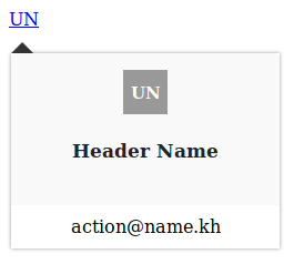
display :

Attributes
| attribute | Type | description | default value | options |
|---|---|---|---|---|
| :user | Object | this object hold user data | {} | { id, name, photo, avatar, email } |
| :position | String | define popover position | 'auto' | 'auto','top','bottom' |
| :trigger | String | accept two options | 'hover' | 'hover','click' |
| :name | Boolean | to display given user's name | false | -- |
| :icon | Boolean | to display avatar | true | -- |
Slots
| Slot name | Description |
|---|---|
| avatar | For Popover avatar located |
| content | For Popover core ( includes both [ **contentinfo, **content_actions ])_ |
| content_info | For Popover header |
| content_actions | For Popover footer |
Next
- Demo : We will publish a demo asap
- Testing : We will add Unit Test


