React-GFG
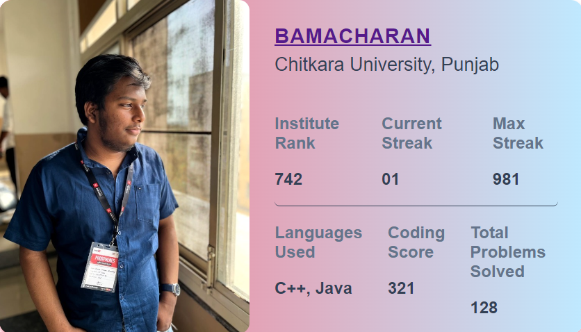
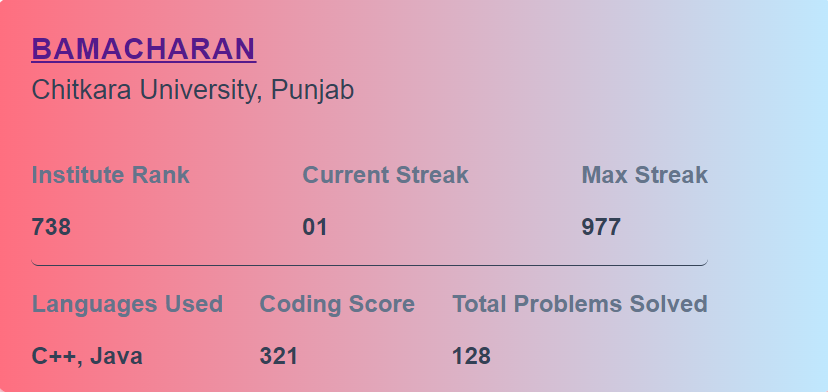
eact-GFG is a comprehensive React component library designed to easily showcase detailed profile information for Geeks for Geeks users. Ideal for embedding in portfolios or web applications.
Full Blog Post
Key Features
- 📈
Profile Stats:Clean and detailed profile stats presented as reusable components. - 🎨
Customizable:Tailor themes and styles to match your application's design. - 🍀
Open Source:Released under the MIT License for flexibility and community contributions.
Installation
- Install via npm:
npm install react-gfg- With Yarn:
yarn add react-gfgUsage
Here’s a quick example of how to integrate the GFGProfile component into your application:
Example
import { GFGProfile } from "react-gfg";

function App() {
  return (
    <div className="w-full flex justify-center items-center">
      <GFGProfile username="bamacharan" />
    </div>
  );
}

export default App;
Advanced Customization
You can change the profile picture using the img prop:
import { GFGProfile } from "react-gfg";

function App() {
  return (
    <div className="w-full flex justify-center items-center">
      <GFGProfile username="bamacharan" img={"imageURL.png"}/>
    </div>
  );
}

export default App;
Or remove the profile picture entirely with the showImg prop:
import { GFGProfile } from "react-gfg";

function App() {
  return (
    <div className="w-full flex justify-center items-center">
      <GFGProfile username="bamacharan" ShowImg={"none"}/>
    </div>
  );
}

export default App;
Custom CSS
The GFGProfile component uses the following customizable CSS classes:
Base Styles
.card:Main container for the profile card..profile-container: Contains the profile image and information..profile-image: The profile image itself..info-container: Holds the user's profile details.
Customizable Styles
body:Font family for the entire component..card:Background color and gradient of the card..username:Username text color and font weight..info-row:Styles for the information rows (e.g., institute rank, streaks).
For detailed information, check the here
Development
- Clone the repository and install dependencies:
git clone https://github.com/BamaCharanChhandogi/react-gfg.git Install the packages
npm install
#or
yarn install
To run example website
`bash cd example
npm run dev
or
yarn dev
- Run the test
```bash
npm run test
#or
yarn test
Contributing
If you would like to contribute to this project, please follow these steps:
- Fork the repo
- Clone the repo
git clone https://github.com/BamacharanChhandogi/react-gfg.git - Create your feature branch (
git checkout -b feature/YourFeature) - Commit your changes (
git commit -am 'Add some feature') - Push to the branch (
git push origin feature/YourFeature) - Create a new Pull Request
License
react-gfg is released under the MIT license.
Thank You
Your contributions and feedback are what make React-GFG better! Thank you for being a part of this project.