 WrathChaos
Version 2 is here 😍
Finally, version 2 is here with much basic usage and re-written code. It does not support a text but it is easy to add a text depends on the dev Typescript support and much cleaner code
Installation
Add the dependency:
npm i react-native-animated-radio-buttonPeer Dependencies
IMPORTANT! You need install them
"@freakycoder/react-native-bounceable": ">= 0.2.5",Usage
Import
import RadioButton from "react-native-animated-radio-button";Basic Usage
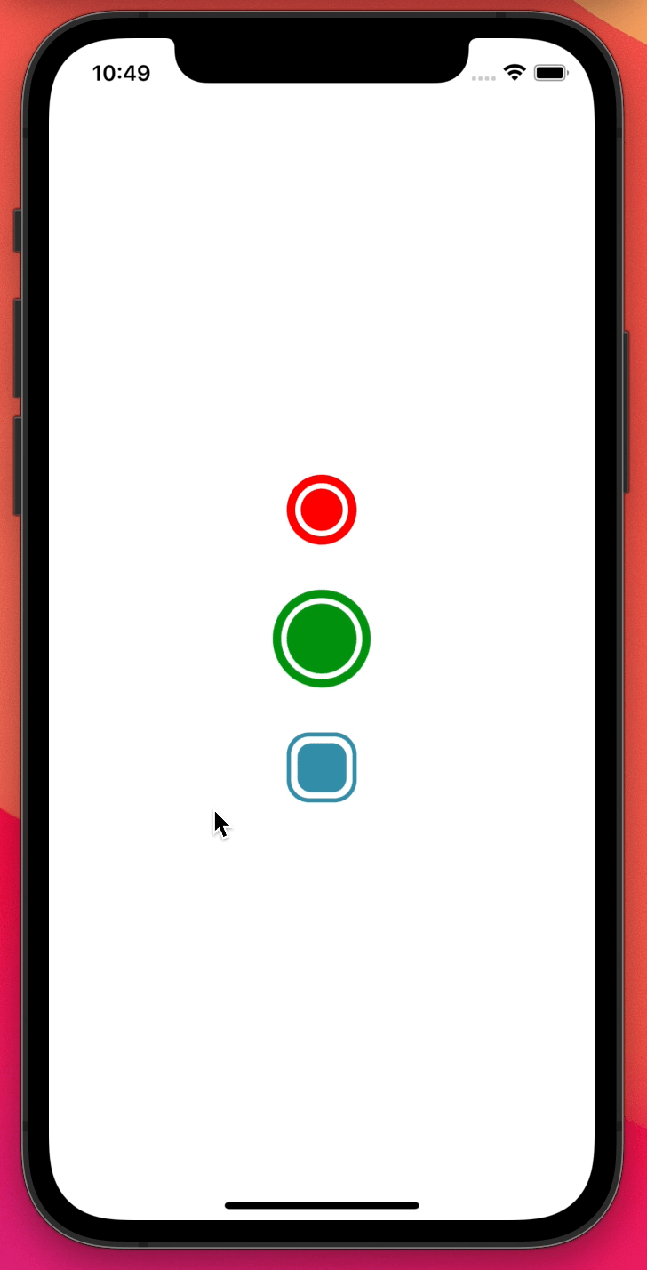
You can check the example out 😏
<RadioButton
  onPress={(isActive: boolean) =>
    console.log("RadioButton isActive: ", isActive)
  }
/>
Customization Usage
<RadioButton
  style={{
    marginTop: 32,
    borderRadius: 16,
    borderWidth: 3,
    borderColor: "#328da8",
  }}
  innerBackgroundColor="#328da8"
  innerContainerStyle={{ height: 35, width: 35, borderRadius: 10 }}
  onPress={(isActive: boolean) => console.log("isActive: ", isActive)}
/>
Configuration - Props
| Property | Type | Default | Description |
|---|---|---|---|
| style | style | default | set the main container's style (outer circle) |
| innerContainerStyle | style | default | set the inner container's style (inner circle) |
| innerBackgroundColor | color | red | change the inner circle's background color |
| initial | boolean | undefined | set the initial activation of the radio button |
| isActive | boolean | undefined | this will disable the built-in state of activation |
| onPress | function | default | set your own function when onPress is triggered |
Future Plans
- <input checked="" disabled="" type="checkbox">
LICENSE - <input checked="" disabled="" type="checkbox">
Horizontal & Vertical text component as optional - <input checked="" disabled="" type="checkbox">
Typescript Challenge! - <input disabled="" type="checkbox"> Write an article about the lib on Medium
Author
FreakyCoder, kurayogun@gmail.com
License
React Native Animated Radio Button is available under the MIT license. See the LICENSE file for more info.