 WrathChaos
Features
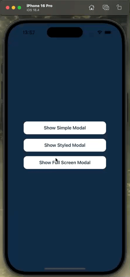
✨ Global Modal Accessible from Anywhere in Your App 🎯 Three Modal Types Out of the Box:
- Simple Modal
- Styled Modal with Animations
- Full Screen Modal 🎨 Fully Customizable Styling 🔄 Smooth Animations 📱 iOS and Android Support
Installation
Add the dependency:
npm i react-native-global-modal-2Peer Dependencies
"react-native-modal": "^13.0.1"Usage
Import
import GlobalModal, { ModalController } from "react-native-global-modal-2"Basic Setup
First, import the necessary components:
import GlobalModal, { ModalController } from "react-native-global-modal-2"Add the GlobalModal component to your app's root:
// App.tsx or your root component
import React, { useRef } from 'react';
import { NavigationContainer } from '@react-navigation/native';
import GlobalModal, { ModalController, GlobalModalRef } from "react-native-global-modal-2";

const App = () => {
  const modalRef = useRef<GlobalModalRef>(null);

  React.useEffect(() => {
    if (modalRef.current) {
      ModalController.setModalRef(modalRef);
    }
  }, []);

  return (
    <NavigationContainer>
      <MainStack />
      <GlobalModal
        ref={modalRef}
        animationIn="fadeIn"
        animationOut="fadeOut"
        onBackdropPress={ModalController.hide}
      />
    </NavigationContainer>
  );
};
Modal Types and Examples
1. Simple Modal
Basic modal with minimal styling:
import { ModalController } from "react-native-global-modal-2";

const showSimpleModal = () => {
  ModalController.show({
    content: (
      <View style={styles.modalContent}>
        <Text style={styles.title}>Simple Modal</Text>
        <Text style={styles.text}>This is a simple modal example</Text>
        <Button title="Close" onPress={() => ModalController.hide()} />
      </View>
    ),
  });
};

const styles = StyleSheet.create({
  modalContent: {
    backgroundColor: '#fff',
    padding: 20,
    borderRadius: 8,
    alignItems: 'center',
  },
  title: {
    fontSize: 18,
    fontWeight: 'bold',
    marginBottom: 10,
  },
  text: {
    marginBottom: 20,
    textAlign: 'center',
  },
});
2. Styled Modal
Modal with custom styling and animations:
const showStyledModal = () => {
  ModalController.show({
    content: (
      <View style={styles.styledContent}>
        <Text style={styles.styledTitle}>Styled Modal</Text>
        <Text style={styles.styledText}>
          Custom styled modal with beautiful design
        </Text>
        <TouchableOpacity
          style={styles.closeButton}
          onPress={() => ModalController.hide()}>
          <Text style={styles.buttonText}>Close</Text>
        </TouchableOpacity>
      </View>
    ),
  });
};

const styles = StyleSheet.create({
  styledContent: {
    backgroundColor: '#4A90E2',
    padding: 30,
    borderRadius: 20,
    alignItems: 'center',
    shadowColor: '#000',
    shadowOffset: { width: 0, height: 2 },
    shadowOpacity: 0.25,
    shadowRadius: 3.84,
    elevation: 5,
  },
  styledTitle: {
    color: '#fff',
    fontSize: 24,
    fontWeight: 'bold',
    marginBottom: 16,
  },
  styledText: {
    color: '#fff',
    marginBottom: 24,
    textAlign: 'center',
  },
  closeButton: {
    backgroundColor: '#fff',
    paddingHorizontal: 20,
    paddingVertical: 10,
    borderRadius: 8,
  },
  buttonText: {
    color: '#4A90E2',
    fontWeight: '600',
  },
});
3. Full Screen Modal
Modal that covers the entire screen:
const showFullScreenModal = () => {
  ModalController.show({
    content: (
      <View style={styles.fullScreenContent}>
        <Text style={styles.fullScreenTitle}>Full Screen Modal</Text>
        <Text style={styles.fullScreenText}>
          This modal takes up the entire screen
        </Text>
        <TouchableOpacity
          style={styles.fullScreenButton}
          onPress={() => ModalController.hide()}>
          <Text style={styles.fullScreenButtonText}>Close</Text>
        </TouchableOpacity>
      </View>
    ),
    isFullScreen: true,
    containerStyle: {
      backgroundColor: '#fff',
    },
  });
};

const styles = StyleSheet.create({
  fullScreenContent: {
    flex: 1,
    justifyContent: 'center',
    alignItems: 'center',
    padding: 20,
  },
  fullScreenTitle: {
    fontSize: 28,
    fontWeight: 'bold',
    marginBottom: 16,
  },
  fullScreenText: {
    fontSize: 18,
    marginBottom: 24,
    textAlign: 'center',
  },
  fullScreenButton: {
    backgroundColor: '#102B43',
    paddingHorizontal: 24,
    paddingVertical: 12,
    borderRadius: 8,
  },
  fullScreenButtonText: {
    color: '#fff',
    fontSize: 16,
    fontWeight: '600',
  },
});
Advanced Usage
Custom Animations
You can customize the modal animations using any animation type from react-native-modal:
<GlobalModal
  animationIn="slideInUp"  // or fadeIn, bounceIn, etc.
  animationOut="slideOutDown"  // or fadeOut, bounceOut, etc.
  animationInTiming={500}  // animation duration in ms
  animationOutTiming={500}
  backdropTransitionInTiming={500}
  backdropTransitionOutTiming={500}
/>
Modal with Form
Example of a modal containing a form:
const showFormModal = () => {
  const [name, setName] = useState('');
  const [email, setEmail] = useState('');

  const handleSubmit = () => {
    // Handle form submission
    console.log({ name, email });
    ModalController.hide();
  };

  ModalController.show({
    content: (
      <View style={styles.formContent}>
        <Text style={styles.formTitle}>Contact Form</Text>
        <TextInput
          style={styles.input}
          value={name}
          onChangeText={setName}
          placeholder="Enter your name"
        />
        <TextInput
          style={styles.input}
          value={email}
          onChangeText={setEmail}
          placeholder="Enter your email"
          keyboardType="email-address"
        />
        <TouchableOpacity
          style={styles.submitButton}
          onPress={handleSubmit}>
          <Text style={styles.submitText}>Submit</Text>
        </TouchableOpacity>
      </View>
    ),
  });
};
Modal with Loading State
Example of a loading modal:
const showLoadingModal = () => {
  ModalController.show({
    content: (
      <View style={styles.loadingContent}>
        <ActivityIndicator size="large" color="#4A90E2" />
        <Text style={styles.loadingText}>Loading...</Text>
      </View>
    ),
  });

  // Hide the modal after some async operation
  setTimeout(() => {
    ModalController.hide();
  }, 2000);
};
Handling Modal Lifecycle
You can use the onShow and onHide callbacks:
ModalController.show({
  content: <YourModalContent />,
  onShow: () => {
    console.log('Modal shown');
    // Perform actions when modal is shown
  },
  onHide: () => {
    console.log('Modal hidden');
    // Clean up or perform actions when modal is hidden
  },
});
Best Practices
Modal Reference: Always set up the modal reference in your root component to ensure it's accessible throughout your app.
Error Handling: Handle cases where the modal reference might not be set:
const showModal = () => { try { ModalController.show({ content: <YourContent />, }); } catch (error) { console.warn('Failed to show modal:', error); } };Styling: Keep modal styles consistent throughout your app by defining a common style theme:
const modalStyles = { content: { backgroundColor: '#fff', borderRadius: 12, padding: 20, }, title: { fontSize: 20, fontWeight: 'bold', }, // ... other common styles };Performance: For modals with complex content, consider using
useMemooruseCallback:const ModalContent = React.memo(() => { const handlePress = useCallback(() => { // Handle press }, []); return ( <View> <Text>Complex Modal Content</Text> <Button onPress={handlePress} title="Action" /> </View> ); });
Configuration
GlobalModal Props
| Property | Type | Description |
|---|---|---|
| defaultStyle | ViewStyle | Default style for the modal container |
| animationIn | string | Entry animation type (e.g., "fadeIn", "slideInDown") |
| animationOut | string | Exit animation type (e.g., "fadeOut", "slideOutUp") |
| ...rest | ModalProps | Any prop from react-native-modal |
ModalData Props
| Property | Type | Description |
|---|---|---|
| content | ReactNode | Modal content to display |
| isFullScreen | boolean | Whether to show as full screen modal |
| containerStyle | ViewStyle | Style for the modal container |
| onShow | function | Callback when modal is shown |
| onHide | function | Callback when modal is hidden |
Styling Examples
Simple Modal
const styles = StyleSheet.create({
  modalContent: {
    backgroundColor: '#fff',
    borderRadius: 16,
    padding: 24,
    alignItems: 'center',
  },
});
Styled Modal
const styles = StyleSheet.create({
  styledContent: {
    backgroundColor: '#4A90E2',
    borderRadius: 20,
    padding: 30,
    alignItems: 'center',
    shadowColor: '#000',
    shadowOffset: { width: 0, height: 2 },
    shadowOpacity: 0.25,
    shadowRadius: 3.84,
    elevation: 5,
  },
});
Full Screen Modal
const styles = StyleSheet.create({
  content: {
    flex: 1,
    width: '100%',
    height: '100%',
    justifyContent: 'center',
    alignItems: 'center',
  },
});
Example Project
To run the example project:
- Clone the repository
- Navigate to the example directory
- Run:
npm install
npx pod-install  # for iOS
npm run ios/android
Future Plans
- <input checked="" disabled="" type="checkbox">
LICENSE - <input checked="" disabled="" type="checkbox">
Custom Layout Feature - <input checked="" disabled="" type="checkbox"> Full Screen Modal Support
- <input disabled="" type="checkbox"> More built-in modal types
- <input disabled="" type="checkbox"> Alert Modal
- <input disabled="" type="checkbox"> Action Sheet Modal
- <input disabled="" type="checkbox"> Bottom Sheet Modal
- <input disabled="" type="checkbox"> Gesture Controls
- <input disabled="" type="checkbox"> Accessibility Improvements
- <input disabled="" type="checkbox"> More Examples and Documentation
Credits
- Design inspiration: Patrick Marx
- Original concept: Roycechua's global modal example
Author
FreakyCoder, kurayogun@gmail.com
License
React Native Global Modal is available under the MIT license. See the LICENSE file for more info.