 amareque

React Native Pro Picker
React Native Pro Picker gives you the option to have an ActionSheet-based picker in iOS while maintaining the basic one for android and the web.

Install 🧰
You can install react-native-pro-picker by running the following command
npm install react-native-pro-pickerUsage 💡
Add the following import statement:
import { ProPicker, ProPickerOption, ProPickerOptionItem } from 'react-native-pro-picker';Add the <ProPicker/> component:
<ProPicker onItemSelected={(item) => {
// Use the selected item.
}}/>
Add the <ProPicker/> component:
<ProPicker onItemSelected={(item) => {
 <ProPickerOptionItem id={1} value={'js'} label={"Javascript"}/>
 <ProPickerOptionItem id={2} value={'ts'} label={"Typescript"}/>
 <ProPickerOptionItem id={3} value={'kt'} label={"Kotlin"}/>
 <ProPickerOptionItem id={4} value={'sw'} label={"Swift"}/>
}}/>
Customize your picker with the customization options.
Necessary Attributes ⚠️
| Attribute | Description | Type |
|---|---|---|
| children | The options to select from. Should be of type ProPickerOptionItem | ProPickerOptionItem | ProPickerOptionItem[] |
| onItemSelected | Callback for when the user selects an item. | () => void |
Customizable Attributes 🕹️
| Attribute | Description | Type | Default Value |
|---|---|---|---|
| placeholder | Picker Placeholder | string | Select... |
| cancelText (iOS only) | Picker cancel button label for iOS Action Sheet | string | Cancel |
| enabled | Enables/Disables the picker | boolean | true |
| backgroundColor | Background color for the picker's main layout | string | #FFFFFF |
| fontColor | Font color for the picker's main layout | string | #000000 |
| iosArrowTintColor | Tint color for the iOS Arrow Icon in the picker's main layout | string | #0451E4 |
| iosBorderColor | Border color for the iOS picker's main layout | string | #000000 |
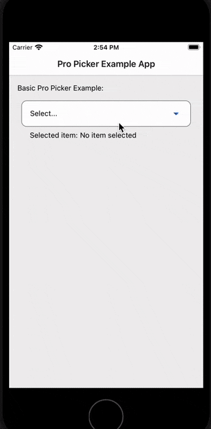
Try it yourself 📱
Download the repo and do:
cd example-app/
npm run start
Contributing 🍰
If you want me to improve this package, feel free to reach out to me, and I'll gladly update it.
Maintainers 👷

Agustin Mareque |
License ⚖️
MIT