 WrathChaos
Installation
Add the dependency:
npm i react-native-segmented-control-2Peer Dependencies
Zero Dependency 🥳
Usage
Import
import SegmentedControl from "react-native-segmented-control-2";Fundamental Usage
<SegmentedControl
  tabs={["Label 1", "Label 2", "Label 3"]}
  onChange={(index: number) => console.log("Index: ", index)}
/>
As controlled component:
const [index, setIndex] = useState(0)
return (
<SegmentedControl
tabs={["Label 1", "Label 2", "Label 3"]}
onChange={setIndex}
value={index}
/>
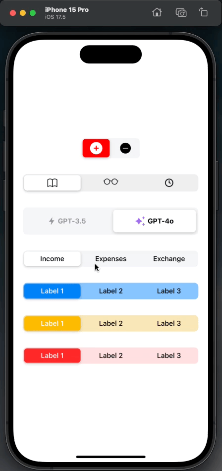
)Customized Usage
<SegmentedControl
  style={{ marginTop: 32, backgroundColor: "#ffe0e0" }}
  activeTabColor="#ff2929"
  activeTextColor="#fff"
  tabs={["Label 1", "Label 2", "Label 3"]}
  onChange={(index: number) => console.log("Index: ", index)}
/>
Any Component Usage
You can use the segmented control with any component.
All you need to do is that put any component into the tabs props.
Please check out the example for its usage
Example Project 😍
You can checkout the example project 🥰
Simply run
npm ireact-native run-ios/android
should work of the example project.
Configuration - Props
Fundamentals
| Property | Type | Default | Description |
|---|---|---|---|
| tabs | any[] | undefined | set the array for tabs |
| onChange | function | undefined | set your own logic when the tab is pressed / changed |
| value | number | undefined | value of index if used as a controlled component |
Customization (Optionals)
| Property | Type | Default | Description |
|---|---|---|---|
| style | ViewStyle | default | set or override the style object for the main container |
| initialIndex | number | 0 | set the initial index |
| activeTextColor | string | #000 | change the active tab's text color |
| activeTabColor | string | #FFF | change the active tab's color |
| gap | number | 0 | set extra spacing for animation horizontal value |
| tabStyle | ViewStyle | default | set or override the style object for the tab |
| selectedTabStyle | ViewStyle | default | set or override the style object for the selected tab |
| activeTextStyle | TextStyle | default | set or override the style object for the active tab's text |
| textStyle | TextStyle | default | set or override the style object for tab's text |
Future Plans
- <input checked="" disabled="" type="checkbox">
LICENSE - <input checked="" disabled="" type="checkbox">
Controller component support(Thanks to @madox2 (https://github.com/WrathChaos/react-native-segmented-control-2/pull/6)) - <input checked="" disabled="" type="checkbox">
Getting rid of screen width and manual width dependencies(Thanks to @philo23 (https://github.com/WrathChaos/react-native-segmented-control-2/pull/7) - <input disabled="" type="checkbox"> Write an article about the lib on Medium
Credits
Heavily inspired by these libraries:
I created this library because they're really not maintain actively and this is a pure javascript written library with a lot of customizations and better code structure
Author
FreakyCoder, kurayogun@gmail.com
License
React Native Segmented Control 2 is available under the MIT license. See the LICENSE file for more info.