⭐️ React Smart Rating
A lightweight, fully customizable React rating component with support for fractional ratings, custom icons, color customization, and read-only mode.
Perfect for product reviews, feedback forms, or any app that needs a modern, flexible rating UI.
🚀 Features
- ⭐ Fractional Ratings (e.g.
4.3,2.7) - ⚙️ Customizable Icons — use any React icon (Lucide, Heroicons, FontAwesome)
- 🎨 Custom Colors & Sizes
- 🔒 Read-only Mode
- 🧩 TypeScript Support
- 💡 Lightweight — under 8KB and no external dependencies (except React)
📦 Installation
React Smart Rating works seamlessly with npm, yarn, and pnpm — choose your favorite package manager 👇
| Package Manager | Command |
|---|---|
| npm | npm install react-smart-rating |
| pnpm | pnpm add react-smart-rating |
| yarn | yarn add react-smart-rating |
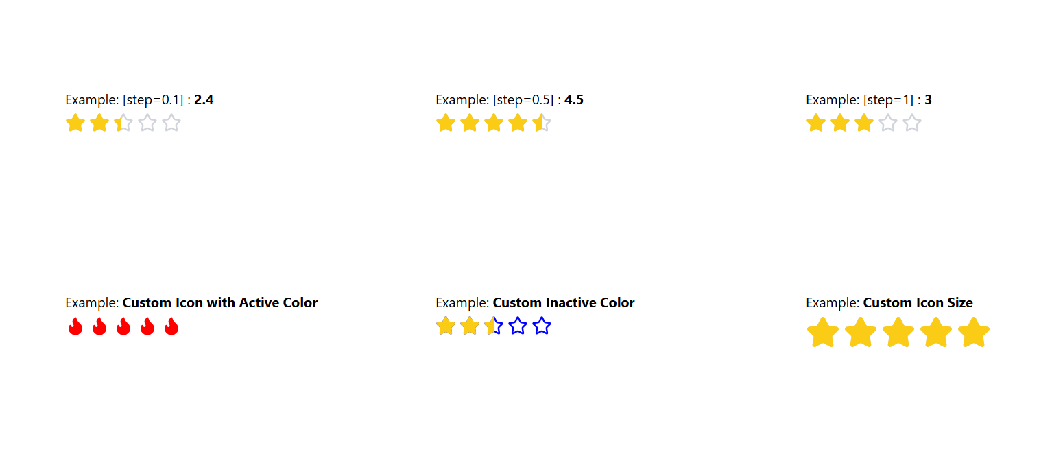
📸 Demo

🧠 Quick Usage
  import { ReactSmartRating } from "react-smart-rating";
  import { Heart } from "lucide-react";

  export default function Example() {
    const [rating, setRating]= useState(5)
    return (
      <div>
        {/* Default */}
        <ReactSmartRating initialRating={rating} onChange={(v) => setRating(v)} />

        {/* Half-step */}
        <ReactSmartRating step={0.5} />

        {/* Custom icon */}
        <ReactSmartRating icon={Heart} activeColor="red" step={0.5} />

        {/* Read only */}
        <ReactSmartRating initialRating={rating} readOnly />
      </div>
    );
  }
⚙️ Props
| Prop | Type | Default | Description |
|---|---|---|---|
totalStars |
number |
5 |
Total number of rating icons |
initialRating |
number |
0 |
Initial (float) rating value |
readOnly |
boolean |
false |
Disable interactions if true |
onChange |
(rating: number) => void |
— | Callback fired when rating changes |
icon |
React.ElementType |
Star |
Custom icon component |
activeColor |
string |
#facc15 |
Color for filled stars |
inactiveColor |
string |
#d1d5db |
Color for empty stars |
size |
number |
24 |
Icon size in pixels |
step |
number |
1 |
Rating step step (1, 0.5, 0.1) |
🧩 Example with Fractional Rating
<RatingStar totalStars={5} initialRating={3.7} step={0.1} readOnly />🪶 License
This project is licensed under the MIT License — see the LICENSE file for details.
Made with ❤️ by Nihar Mondal


