React Snackbars Stack


React Snackbars Stack to show multiple snackbars as queue/stack
Description
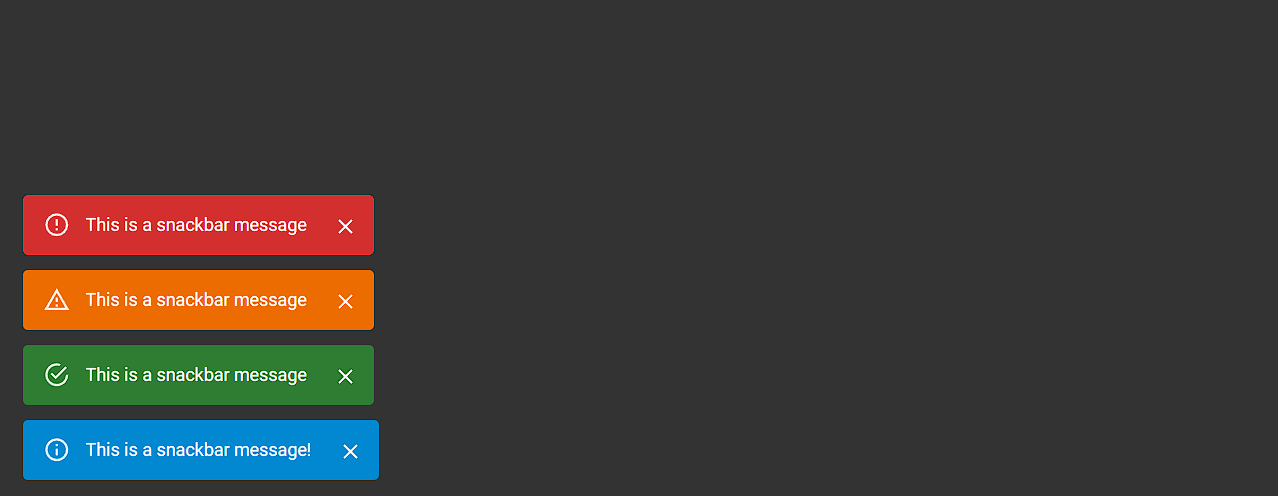
React Snackbars Stack is a flexible and easy-to-use library for displaying snackbars in your React applications. It provides a simple API to show notifications with different severities and customizable options. Whether you need to show a single snackbar or manage a stack of multiple snackbars, this library has you covered.
Installation
Install the package using npm or yarn:
npm install react-snackbars-stack
# or
yarn add react-snackbars-stack
Usage
Option 1: Direct Use
Import the SnackbarProvider and wrap your application with it. Use the enqueueSnackbar method to show snackbars.
🚀 Important Note: You don't need to wrap your entire application with the
SnackbarProvidercontext. You can use it directly in any component by placing it inside the render method, such as the return statement in a function component or the render method in a class component.
import React from 'react';
import { SnackbarProvider, enqueueSnackbar } from 'react-snackbars-stack';

function App() {
  const handleClick = () => {
    enqueueSnackbar('This is a snackbar message!');
    // OR
    enqueueSnackbar(
      'This is a snackbar message with applied options!',
      {
        severity:'success', // inof, success, warning, error
        preventDuplicate:true,
        duration:1500
      }
    );
  };

  return (
    <>
      <SnackbarProvider /> {/* Check API for options */}
      <button onClick={handleClick}>Show Snackbar</button>
    </>
  );
}

export default App;
Option 2: Using Hook
Wrap your root app or a specific parent app with the SnackbarProvider context. Import the hook in a child component to use the method to show snackbars.
import React from 'react';
import { SnackbarProvider, useSnackbar } from 'react-snackbars-stack';

function MyComponent() {
  const { enqueueSnackbar } = useSnackbar();

  const handleClick = () => {
    enqueueSnackbar(...);
  };

  return (
    <>
      <button onClick={handleClick}>Show Snackbar</button>
    </>
  );
}

const App = () => (
  <SnackbarProvider>
    <MyComponent />
  </SnackbarProvider>
);

export default App;
NextJS support
If you're using Next.js and need to integrate the react-snackbars-stack package into your root layout (or any server component), you’ll need to handle the use client directive. This is required because the context provider relies on React hooks, which are incompatible with server components by default.
Create a Wrapper Component, e.g., SnackbarProviderWrapper.jsx, with the use client directive.
'use client';

import { SnackbarProvider } from 'react-snackbars-stack';

export default SnackbarProvider;
Screenshot

API
enqueueSnackbar Method
The enqueueSnackbar method is used to show a snackbar notification. If there are already some snackbars being displayed, it adds the snackbar above or below the existing snackbars in the stack.
| Option | Type | Description | Default |
|---|---|---|---|
| message | string | The message to display | - |
| severity | string | The severity of the message | 'info' |
| preventDuplicate | boolean | Prevent duplicate messages | false |
| duration | number | Duration to show the snackbar (ms) | 3000 |
SnackbarProvider Component
The SnackbarProvider component is used to wrap your application and provide the snackbar context.
| Option | Type | Description | Default |
|---|---|---|---|
| maxSnackbars | number | Maximum number of snackbars to show | 3 |
| autoHideDuration | number | Duration to auto-hide the snackbar | 3000 |
| icon | boolean | Hide the icon in the snackbar | true |
| theme | string | Theme of the snackbar ('dark' or 'light') | 'light' |
| anchorOrigin | object | Position of the snackbar | { vertical: 'bottom', horizontal: 'left' } |
| transitionType | string | Transition type for the snackbar ('slide', 'grow', 'fade', 'zoom') | 'slide' |
TODO
- <input checked="" disabled="" type="checkbox"> Custom hook support
- <input checked="" disabled="" type="checkbox"> Theme switching (MUI based)
- <input disabled="" type="checkbox"> Filled icons option
- <input disabled="" type="checkbox"> Custom theming support
- <input disabled="" type="checkbox"> Custom transitions
Purpose: Created for personal use due to Notistack's outdated dependencies causing deployment issues. Published for anyone seeking an alternative to Notistack (though this package is not superior to Notistack).
Connect with Us
Feel free to reach out:
Contribution
Contributions are welcome! Please open an issue or submit a pull request on GitHub.
License
This project is licensed under the MIT License. See the LICENSE file for details.