react-ui89
A collection of components that mimic a common style of user interfaces from the late 80s and early 90s.

Install
npm install react-ui89Usage
To get started, import the CSS file and place a Ui89Scene component as the
root element of your layout.
Then, add any other react-ui89 components as needed to create your desired UI.
import 'react-ui89/dist/esm/index.css'
import {
  Ui89Scene,
  Ui89Card,
  Ui89SpaceVertical,
  Ui89Button,
  Ui89TitleBox,
} from 'react-ui89'

export default function Page() {
  return (
    <Ui89Scene>
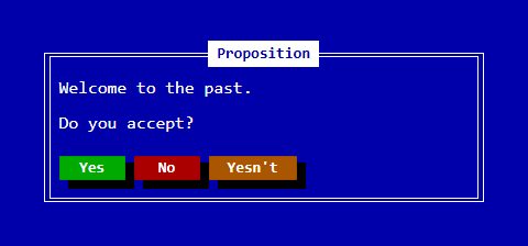
      <Ui89Card topCenter={<Ui89TitleBox>Proposition</Ui89TitleBox>}>
        <Ui89SpaceVertical gap={1} />
        Welcome to the past.
        <Ui89SpaceVertical gap={1} />
        Do you accept?
        <Ui89SpaceVertical gap={2} />
        <Ui89Button theme="success">Yes</Ui89Button>
        <Ui89Button theme="danger">No</Ui89Button>
        <Ui89Button theme="warning">Yesn't</Ui89Button>
      </Ui89Card>
    </Ui89Scene>
  )
}
Documentation
This project uses storybook. Storybook is an open-source tool for building and organizing UI components in isolation.
npm run storybookDevelopment
Storybook is also used for development.
npm run storybookContributing
The easiest way to contribute is by starring this project on GitHub!
https://github.com/daniel-araujo/react-ui89
If you've found a bug, would like to suggest a feature or need some help, feel free to create an issue on GitHub: